The NQ April Rally: Market Structure, Measured Moves, and Market Profile
The first week of April 2026 delivered one of the cleanest structural rallies we have seen on NQDefinitionE-mini Nasdaq 100 futures contract. Known for fast, volatile moves. 1 tick = $5, 1 point = $20. in months. From the March 31 low near 22,900 to the April 7 highs above 24,600, every leg of this move printed textbook market structure — BOSDefinitionBreak of Structure — price breaks the previous swing point in the trend direction. Confirms continuation. after BOS, clean measured moveDefinitionA price projection where Leg B equals Leg A. Primary target is the -23.6% extension beyond 100%. targets, and market profile confirmations that gave traders multiple entries along the way.
Let us walk through what happened, what our indicators showed, and why the April 2 measured moveDefinitionA price projection where Leg B equals Leg A. Primary target is the -23.6% extension beyond 100%. target was not a coincidence.
The Rally Begins: March 31 Structure Shift
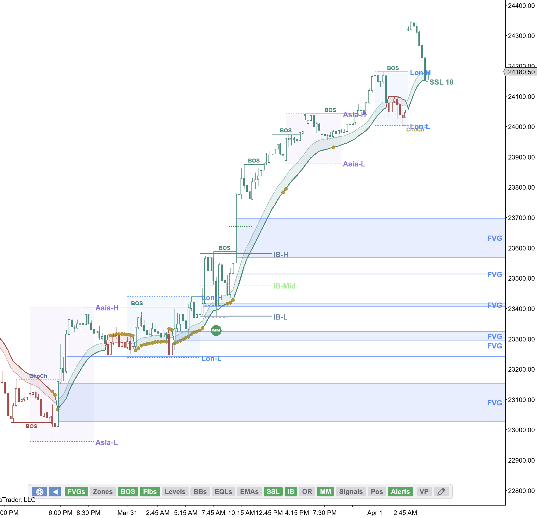
This 15-minute chart tells the entire story. Starting from the March 31 lows, NQDefinitionE-mini Nasdaq 100 futures contract. Known for fast, volatile moves. 1 tick = $5, 1 point = $20. printed a Change of Character (CHoCH) that flipped the structure bullish. From there, it was BOSDefinitionBreak of Structure — price breaks the previous swing point in the trend direction. Confirms continuation. after BOS — each swing low holding higher than the last, each swing highDefinitionA peak on the chart where price reversed lower. Marks where sellers previously overpowered buyers. breaking the previous one.
If you are new to swing structure, here is what a BOS looks like. The CHoCHDefinitionChange of Character — the first warning a trend may be ending. Price breaks a swing point against the trend. is the first warning of a trend change. The BOSDefinitionBreak of Structure — price breaks the previous swing point in the trend direction. Confirms continuation. confirms it:

On the NQDefinitionE-mini Nasdaq 100 futures contract. Known for fast, volatile moves. 1 tick = $5, 1 point = $20. chart above, the March 31 CHoCHDefinitionChange of Character — the first warning a trend may be ending. Price breaks a swing point against the trend. flipped the bias from bearish to bullish. Every green BOSDefinitionBreak of Structure — price breaks the previous swing point in the trend direction. Confirms continuation. label after that was a continuation confirmation — the market kept making higher highs and higher lows.

Notice how the FVGs (Fair Value Gaps) stack up on the left side of the move. Every pullback found support at a prior FVGDefinitionFair Value Gap — a three-candle pattern leaving a price void. Price tends to return and fill these gaps. or demand zoneDefinitionA price area where buyers previously overwhelmed sellers. Expect buying when price returns here.. The EMAs fanned out cleanly with price riding the SSLDefinitionSSL Channel — a trend-following overlay combining moving average crossovers with volatility bands for direction and entries. channel — no chop, no indecision, just a clean trend with structure confirming every leg.
The Initial Balance on April 1 set the tone early. Price broke above IBDefinitionInitial Balance — the price range of the first hour of regular trading. Sets the day's reference range.-H and never looked back, extending through the Asia and London session highs as each new session added fuel.
The April 2 Measured Move: 61.8% Was Not a Coincidence
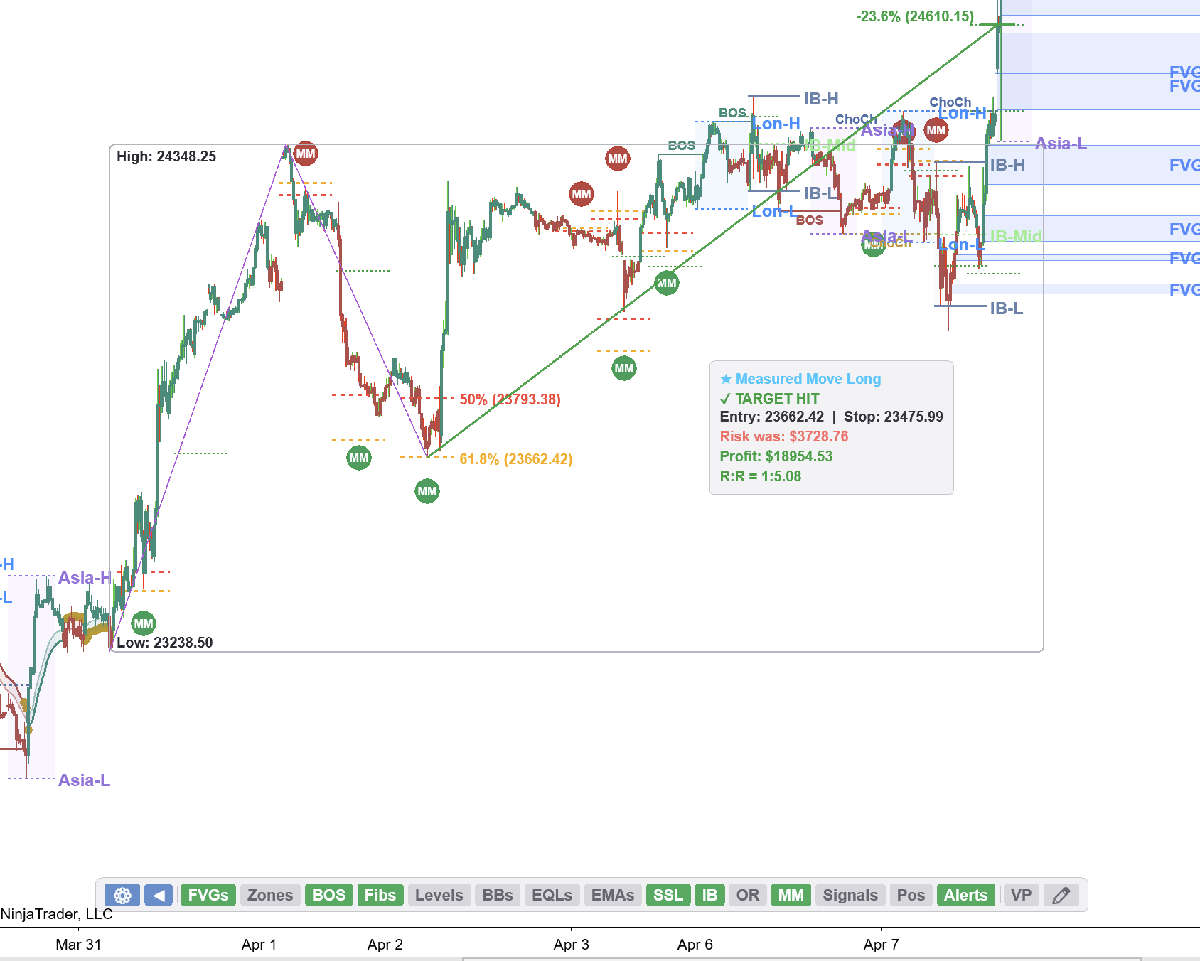
This is the chart that makes the case for measured moves. After the initial impulse off the March 31 lows, NQDefinitionE-mini Nasdaq 100 futures contract. Known for fast, volatile moves. 1 tick = $5, 1 point = $20. pulled back on April 2 and found support precisely at the 61.8% Fibonacci retracement at 23,662.

The indicator flagged this as a Measured MoveDefinitionA price projection where Leg B equals Leg A. Primary target is the -23.6% extension beyond 100%. Long with an entry at 23,862, a stop at 23,475, and a target at the -23.6% extension at 24,610. The result: target hit, 1:5 risk-to-reward, and a profit of nearly $19,000 on a single measured move signal.
Was it a coincidence that the 61.8% held? Look at the context — the retracement level sat right at a prior demand zoneDefinitionA price area where buyers previously overwhelmed sellers. Expect buying when price returns here., a session VALDefinitionValue Area Low — the lower boundary of the zone where 70% of volume traded., and the 21 EMADefinitionExponential Moving Average — weights recent prices more heavily than older ones for faster trend response. was catching up from below. That is not a coincidence. That is confluenceDefinitionMultiple independent signals or levels aligning at the same price area. More confluence = higher probability.. The measured moveDefinitionA price projection where Leg B equals Leg A. Primary target is the -23.6% extension beyond 100%. target at 24,610 was far above the trading range at the time, and it hit anyway. When structure, Fibonacci, and market profile all agree, the targets tend to work.
Key Insight
When a measured move target seems unreasonably far away, that is often exactly when it hits. The market does not care what seems reasonable — it cares about where the liquidity is.
Single Print Bounces: The Market Profile Edge
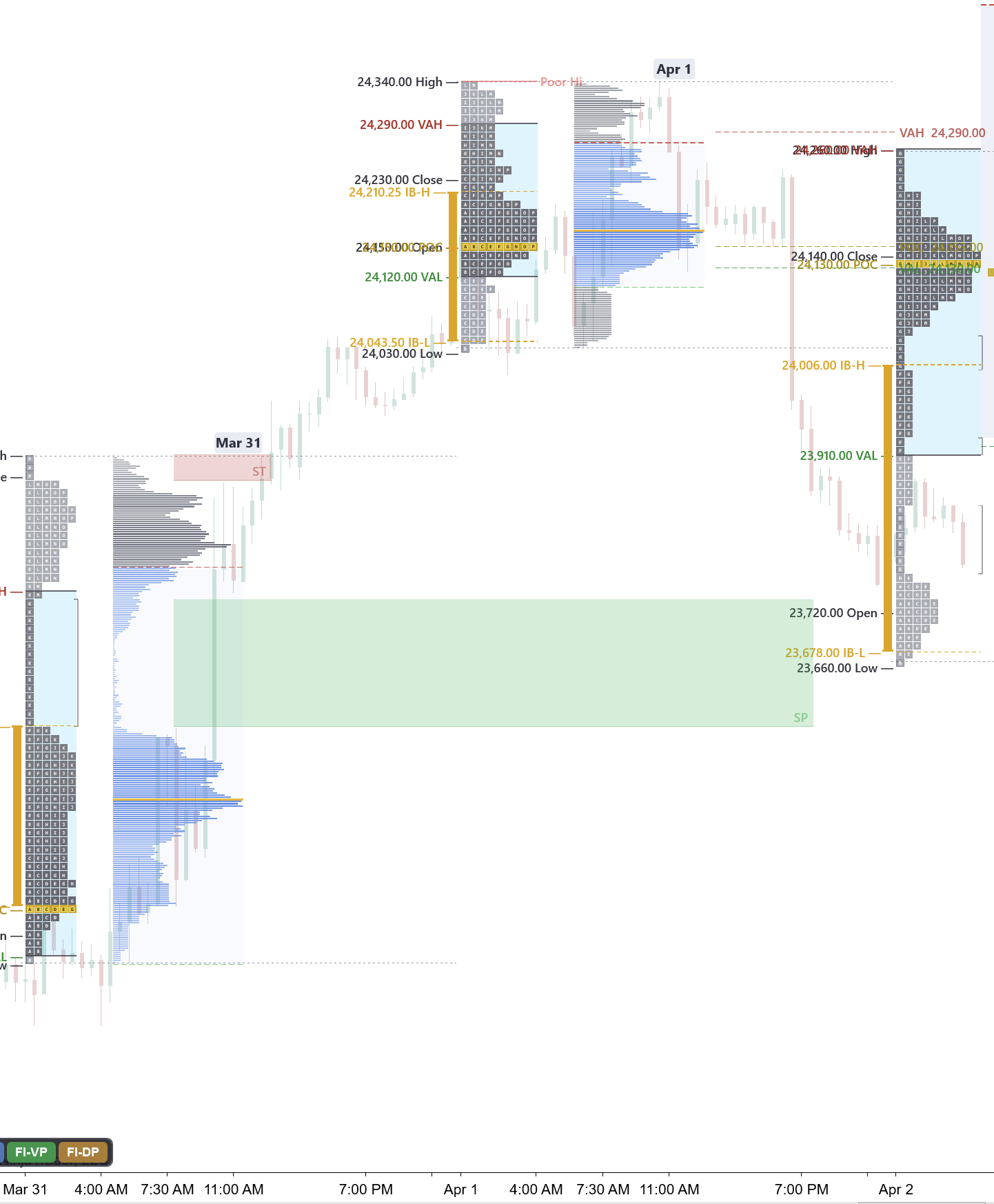
The March 31 session left behind a clear set of single prints — those thin areas on the market profile where price moved through quickly with only one TPODefinitionTime Price Opportunity — a letter printed at each price level per 30-minute period on a Market Profile chart. letter. Single printsDefinitionPrice levels with only one TPO letter — price moved through quickly. Often act as support or resistance. represent rejection. The market said "we do not belong here" and moved away fast.

When April 1 opened, it gapped above the March 31 value area. The green shaded zone shows the single printDefinitionPrice levels with only one TPO letter — price moved through quickly. Often act as support or resistance. area from the prior session. Price respected it perfectly — the gap held, and the rally continued without ever filling back into those single prints.
This is one of the most reliable setups in market profile trading. When you see single printsDefinitionPrice levels with only one TPO letter — price moved through quickly. Often act as support or resistance. from a prior session and the next session opens above them, those prints become your floor. As long as they hold, the auction is incomplete to the upside and price has unfinished business higher.
April 2-7: Single Prints Keep Working
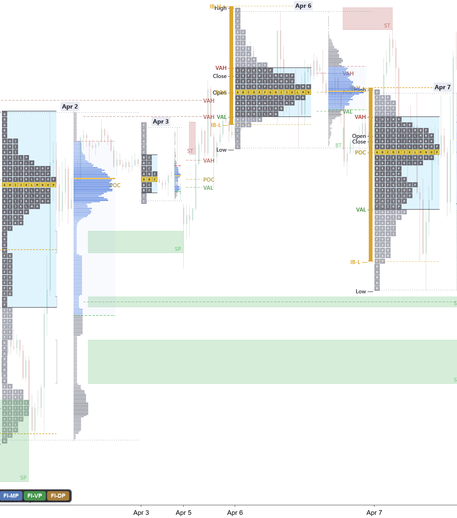
This multi-day market profile view is where it gets really interesting. Look at how each session builds on the last. The April 2 session left single printsDefinitionPrice levels with only one TPO letter — price moved through quickly. Often act as support or resistance. that April 3 respected. April 5 and 6 stacked value higher and higher, each session leaving its own set of single prints below.
By April 7, you can see the entire staircase of value area migration — each day printing higher POCs, higher VAHs, and higher VALs. The green shaded zones mark the single printDefinitionPrice levels with only one TPO letter — price moved through quickly. Often act as support or resistance. areas that held as support throughout the week. Every time price retested a prior single print zone, it bounced.

This is the power of market profile analysis during a trending market. The profiles are not balanced D-shapes — they are P-shapes (volume concentrated at the top) with thin tails below, confirming that buyers were in control at every session.

April 7: The Launch Day
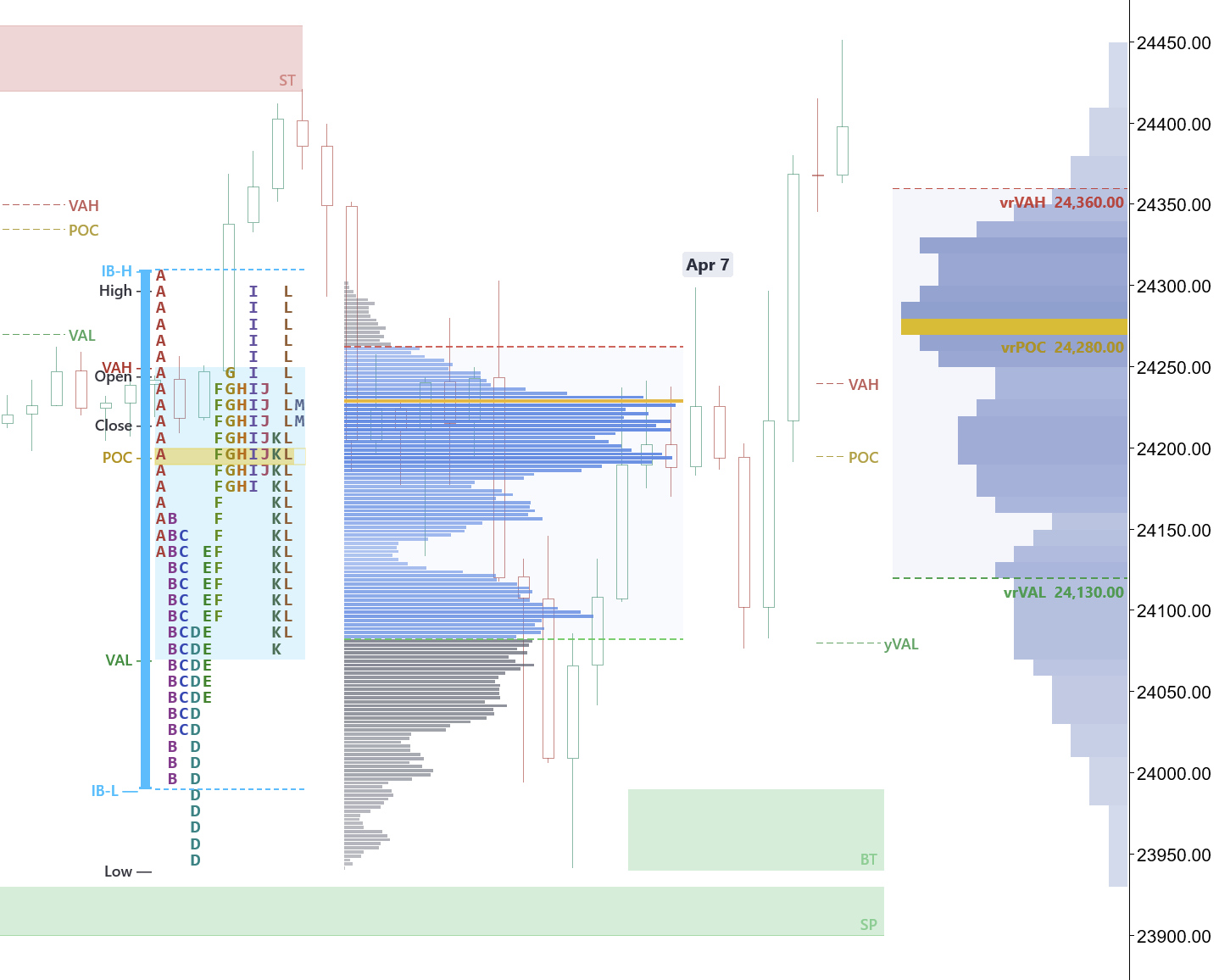
April 7 was the launch day. Price opened and immediately retested a single print zone left behind from a prior session. That retest held perfectly — buyers stepped in at the single printDefinitionPrice levels with only one TPO letter — price moved through quickly. Often act as support or resistance. level and formed a buying tail at the bottom of the profile.

What made this session so powerful was how balanced it looked through most of the day. The profile built a relatively symmetric shape with volume concentrated in the middle — not the kind of session that screams "trend day" during regular hours. But that balance was deceptive. The buying tail at the low told you the floor was in, and the single printDefinitionPrice levels with only one TPO letter — price moved through quickly. Often act as support or resistance. retest from the prior session confirmed the level.
Then after the close, the move launched. Price extended higher into the after-hours session, blowing through the regular session high and targeting the prior composite VAHDefinitionValue Area High — the upper boundary of the zone where 70% of volume traded. and the measured moveDefinitionA price projection where Leg B equals Leg A. Primary target is the -23.6% extension beyond 100%. extension from the April 2 signal. The POCDefinitionPoint of Control — the price with the highest volume. Where the most trading happened. sat in the middle of the day's range, but the real story was the tail — that single printDefinitionPrice levels with only one TPO letter — price moved through quickly. Often act as support or resistance. retest and buying tail combination was the setup. The balanced session was accumulation. The after-hours move was distribution.
Look at the composite profile on the right side of the chart. The multi-day composite POCDefinitionPoint of Control — the price with the highest volume. Where the most trading happened. — the price level with the most volume across several sessions — was sitting right above the regular session high. When the after-hours move launched, it sliced straight through the composite POC. That level had been acting as a ceiling for days, and once it was taken out, there was nothing above it but thin air. The composite POC breakout confirmed the move was real — not just an after-hours stop run.
This is classic auction market theory in action. The regular session built the value area, tested a prior-session single printDefinitionPrice levels with only one TPO letter — price moved through quickly. Often act as support or resistance., and consolidated below the multi-day composite POCDefinitionPoint of Control — the price with the highest volume. Where the most trading happened.. The after-hours move was initiative activity — someone with conviction was buying into thin liquidityDefinitionResting orders (stop losses, limit orders) at known levels. Institutions need liquidity to fill large positions. to take out the composite POC and target levels that the regular session could not reach.
What the Indicators Showed
Every signal in this rally was visible in real-time using the FI Market Structure and FI OrderFlow indicators:
- BOS/CHoCH labels on the 15-minute chart marked every structural shift from the March 31 CHoCHDefinitionChange of Character — the first warning a trend may be ending. Price breaks a swing point against the trend. through the final BOSDefinitionBreak of Structure — price breaks the previous swing point in the trend direction. Confirms continuation. on April 7
- Measured move targets flagged the 61.8% entry on April 2 with a precise -23.6% extension target at 24,610 — which hit days later
- FVG zones highlighted every imbalanceDefinitionA price level where one side overwhelms the other by 3:1 or more. Shows where big players committed. that served as support on pullbacks
- Market Profile with TPODefinitionTime Price Opportunity — a letter printed at each price level per 30-minute period on a Market Profile chart. letters showed the value area migration, single printDefinitionPrice levels with only one TPO letter — price moved through quickly. Often act as support or resistance. zones, and session shapes that confirmed the bullish auction
- Session levels (IBDefinitionInitial Balance — the price range of the first hour of regular trading. Sets the day's reference range., VWAPDefinitionVolume Weighted Average Price — the average price weighted by volume. Institutional benchmark for fair value., prior day high/low) provided the framework for each day's trade plan
The best part: none of this required hindsight. The structure was printing in real-time, the measured moveDefinitionA price projection where Leg B equals Leg A. Primary target is the -23.6% extension beyond 100%. target was set on April 2, and the market profile was building the staircase one session at a time.
Key Takeaways
The April rally was not random. It was a textbook demonstration of how market structure, measured movesDefinitionA price projection where Leg B equals Leg A. Primary target is the -23.6% extension beyond 100%., and market profile analysis work together:
- Structure first: The CHoCHDefinitionChange of Character — the first warning a trend may be ending. Price breaks a swing point against the trend. on March 31 flipped the bias. Every BOSDefinitionBreak of Structure — price breaks the previous swing point in the trend direction. Confirms continuation. after that confirmed it. Do not fight structure.
- Measured moves work: The 61.8% retracement on April 2 was not luck. When you have confluenceDefinitionMultiple independent signals or levels aligning at the same price area. More confluence = higher probability. between Fibonacci levels, demand zonesDefinitionA price area where buyers previously overwhelmed sellers. Expect buying when price returns here., and EMAs, the extension targets tend to hit — even when they seem far away.
- Single prints are your edge: In a trending market, prior session single printsDefinitionPrice levels with only one TPO letter — price moved through quickly. Often act as support or resistance. are the most reliable support/resistance levels available. They tell you exactly where the market rejected price, and those rejections tend to hold on retest.
- Market profile shows the auction: P-shaped profiles, migrating value areas, and buying tails all confirmed that this was a real trend — not a squeezeDefinitionLow volatility compression — Bollinger Bands inside Keltner Channels. Expect an explosive move when it fires. or short-covering rally.
Want to learn more about these concepts? Check out our free Market Structure, Market Profile, and Measured Moves courses.

