See What Traded — and What's About to Trade
Footprint, Depth of Market, Volume Profile, Market Profile (TPO), Cumulative Delta, and Delta Bars — all in one NinjaTrader 8 indicator.
No credit card required. Full access for 5 days.
Six Indicators in One
Footprint Chart + Depth of Market + Volume Profile + Market Profile (TPO) + Cumulative Delta + Delta Bars — combined into a single NinjaTrader indicator for the first time.
Footprint
Bid x Ask at every price inside each candle
Depth of Market
Live order book — inline on chart or pop-out window
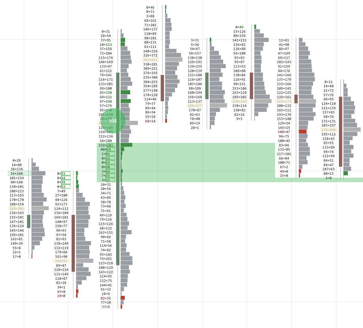
Volume Profile
Session & weekly volume distribution with POC/VAH/VAL
Market Profile
TPO charts with IB, profile shapes, and poor highs/lows
Cumulative Delta
Running total of aggressive buying vs. selling
Delta Bars
Per-bar net delta as a color-coded histogram
Why Order Flow Changes Everything
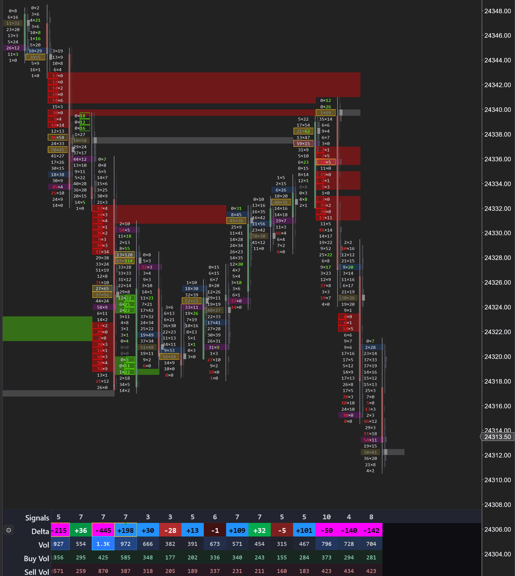
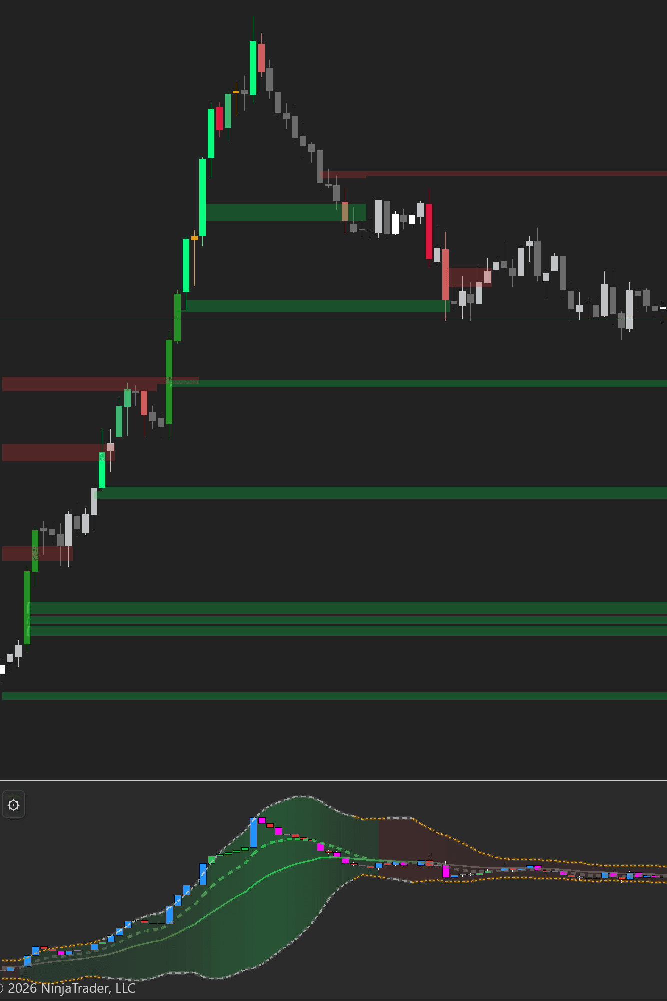
This is a real MNQ (Micro Nasdaq) chart. A standard candlestick chart would show you nothing here — just candles moving down. The footprint tells a completely different story.
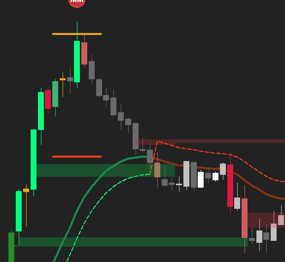
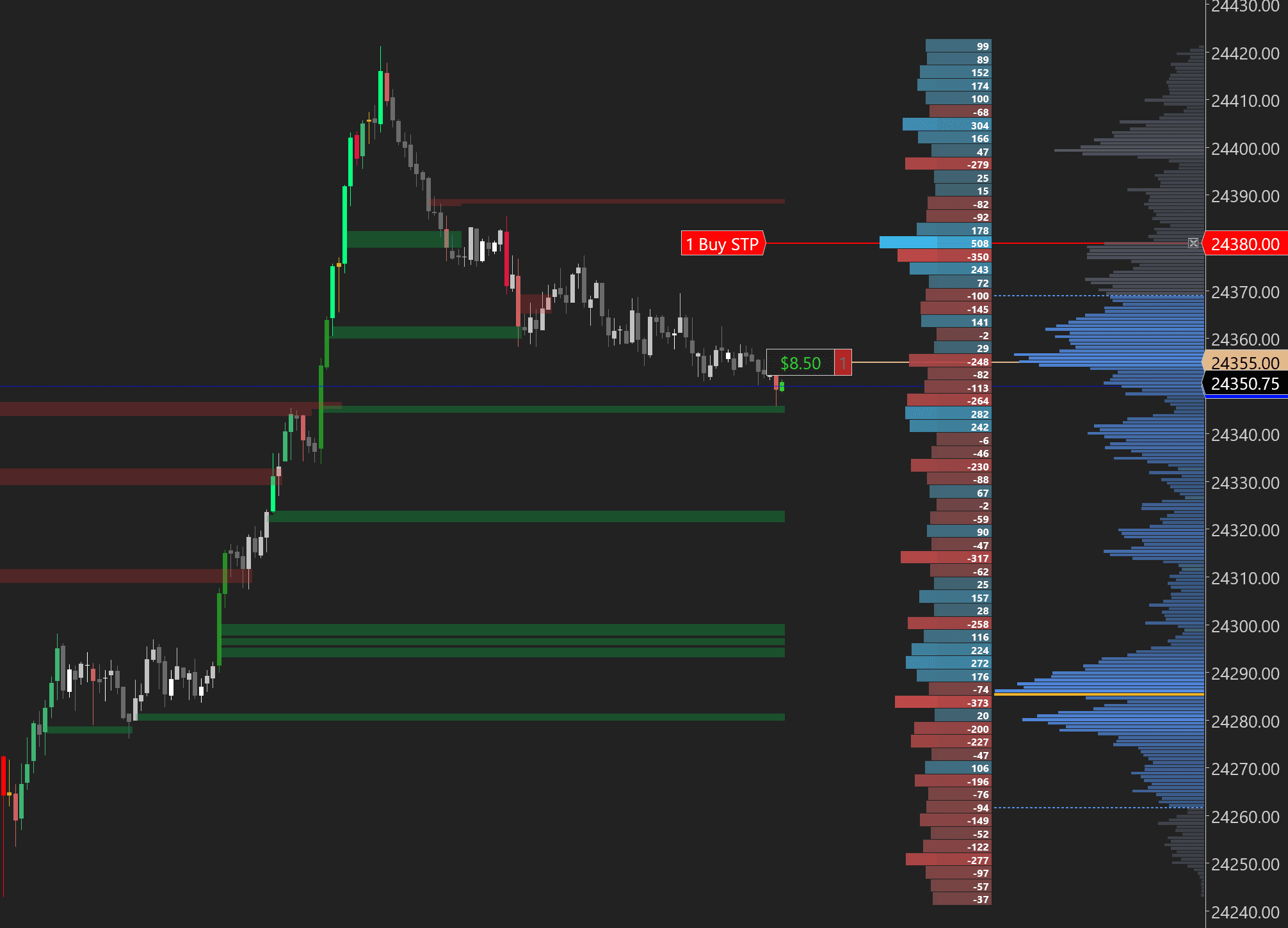
1. Stacked Selling Imbalances Form Resistance
The initial sell-off creates stacked imbalances — consecutive price levels where aggressive selling overwhelmed buyers by 3:1 or more. The indicator automatically plots these as red horizontal zones projecting forward. These aren't arbitrary lines on a chart — they mark the exact prices where institutional sellers committed size.
2. Aggressive Buying Pushes into the Zone — +101 Delta on Average Volume
Price rallies back into the stacked imbalance zone with a delta of +101 on average volume (~450 contracts). On a standard chart, this looks like any other pullback. But the footprint tells you what's actually happening: buyers are aggressive enough to push price up, but they're doing it on ordinary volume. They don't have the conviction to break through the zone where institutional sellers already committed size. The tape is showing you a test, not a breakout.
3. Volume Doubles + New Stacked Imbalance = Short Continuation
The moment price touches the stacked imbalance zone, everything changes. Volume nearly doubles — jumping from ~450 to 700-800+ contracts per bar. New selling imbalances stack at the same price levels. Sellers aren't just present, they're aggressive. Delta bars flip hard negative: -50, -140, -142. That's aggressive selling hitting the bid with conviction. The shorts who built positions here are defending them with almost double the volume of the rally that tested them. Price drops away from the zone. Without the footprint, you'd be guessing if the level would hold. With it, you saw the volume surge, the new imbalances forming, and the aggressive negative delta — the trade was confirmed before price even started moving.
This is the core order flow read: imbalance zone + retest + new imbalance = continuation. The footprint shows you the aggressive participants defending their positions in real time, as it prints.
See Inside Every Candle
A standard candlestick tells you four numbers: open, high, low, close. A footprint chart tells you everything that happened inside that candle — every price level, how many contracts traded there, and whether they were aggressive buyers (market orders hitting the ask) or aggressive sellers (market orders hitting the bid).
This is how institutional traders and prop firms read the market. Instead of guessing from price patterns, you see the actual order flow — where large players are placing their bets, where liquidity is being absorbed, and where imbalances signal that one side is about to overwhelm the other.
Choose from 4 bar styles — switch instantly from the menu:
Bid x Ask
The classic footprint view. Left column = volume at the bid (sellers), right column = volume at the ask (buyers). Highlighted rows show imbalances where one side dominates by 3:1 or more — the signature of aggressive institutional activity.
Delta Profile
Each row displays the net delta (ask volume minus bid volume) as a colored horizontal bar. Green = net buying, red = net selling. See at a glance which price levels attracted aggressive directional flow.
Volume Profile
A clean volume-at-price histogram inside each candle with bubble markers highlighting big trades. The widest bar is the Point of Control (POC) — the single price level where the most volume traded within that bar. Bubbles make it easy to spot where large orders hit the market at a glance.
VP + Imbalances
Combines the volume profile with imbalance markers. Red and green indicators along the profile highlight levels where buying or selling was disproportionately aggressive — the exact price levels where the market showed its hand.
Value Area Migration
Track how the Value Area shifts session to session on a 5-minute footprint. When each session's VA steps lower with negative delta confirming — you're in a healthy downtrend. When VAs overlap, the market is in balance. The simplest multi-session signal in profile analysis, visible at a glance on your chart.
Start with Bid x Ask mode to learn footprint reading. Once you can spot imbalances and absorption patterns, switch to VP + Imbalances for a cleaner view that still highlights the critical levels.
What this tells you
- Where large aggressive orders are entering the market
- Whether buyers or sellers are in control at each price level
- Imbalance zones where one side overwhelmed the other 3:1+
- Absorption — where large passive orders are soaking up aggression without price moving
New to Order Flow?
We built a free learning section that takes you from zero to reading footprint charts with confidence — with real chart examples from this indicator.
What Is a Footprint Chart?
Bid x Ask, how to read the numbers, what every element means
Imbalances & Stacked Imbalances
3:1 ratios, stacked zones as S/R, how institutions leave footprints
Delta & Cumulative Delta
Net aggression per bar, session totals, divergences that signal reversals
POC & Value Area
Point of Control, VAH, VAL — where 70% of volume traded
Absorption & Unfinished Business
Passive orders soaking aggression, incomplete auctions at price extremes
Footprint Trading Workflow
Putting it all together — a step-by-step process for reading the tape
See What's About to Happen
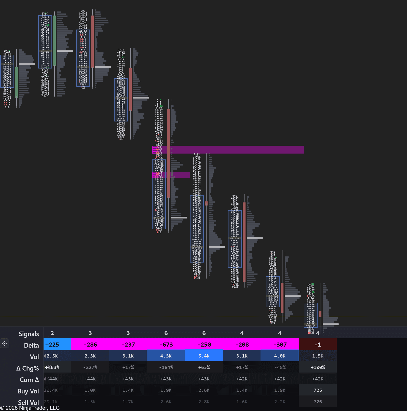
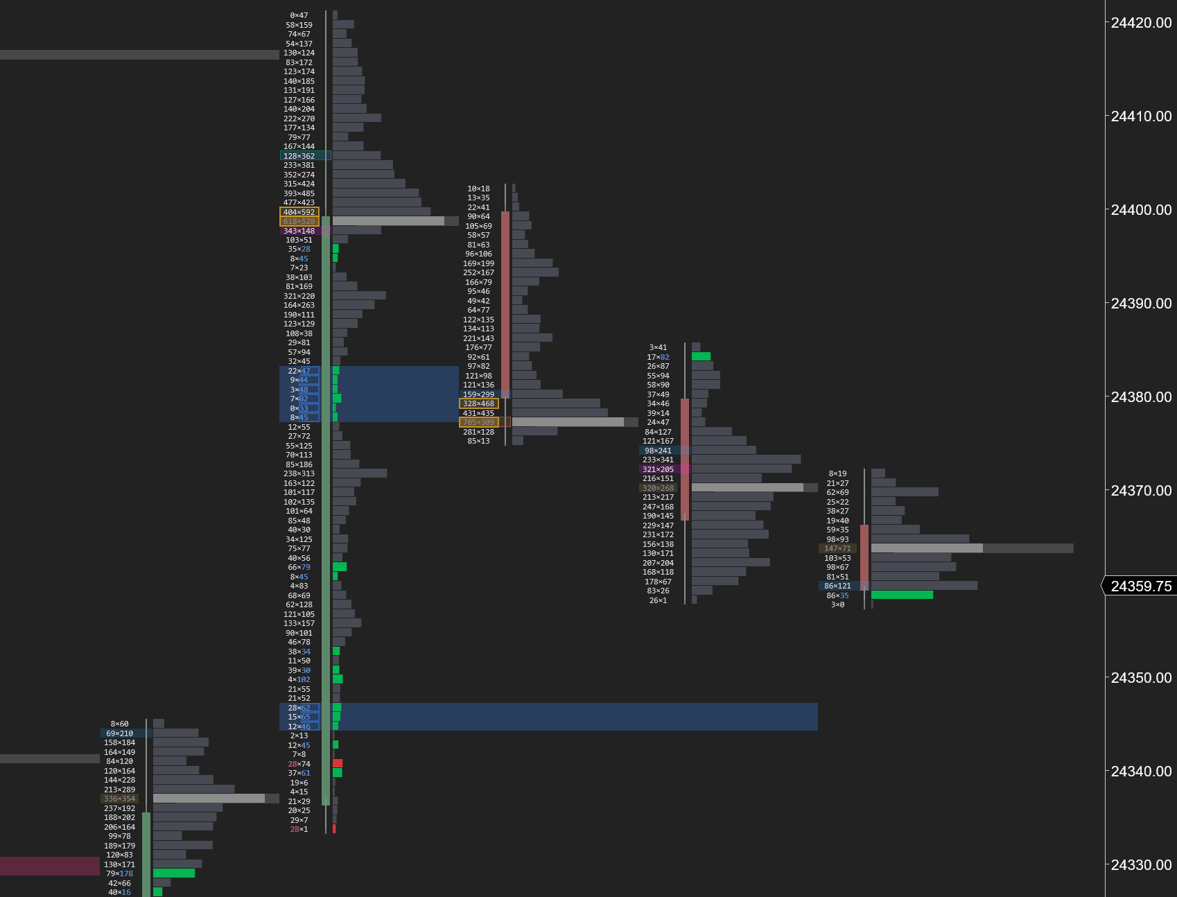
A live Depth of Market (DOM) window opens in one click straight from the indicator. Where a footprint shows you what already traded, the DOM shows you what traders are about to do — every bid below the market and every ask above it, refreshing tick by tick.
It's the only tool in your stack that shows where the big resting orders are stacked, where the gaps are that price will run through, and how those orders behave the moment price gets there.
Inline DOM — footprint + order book on the same chart
No more juggling windows. The full DOM now docks right next to your footprint, price-aligned row-by-row. Wall depth, delta, volume, bid-stacking, pulled liquidity, ask-aggression — all of it sitting on the same Y-axis as your traded volume, so cause and effect are obvious at a glance.
Each DOM row lines up exactly with a footprint price level — what traded vs. what's resting, side by side. The big bid walls on the right column show you where buyers stacked support; the pulled-liquidity column shows the gaps that opened when those bids vanished. Read the move before it happens, then watch it confirm in the footprint cells right next to it.
Need more? Pop the DOM out.
The inline DOM keeps the essentials right on your chart. For the full feature set — every column, deeper price levels, bookmap heatmap, larger cells for active scalping — pop it out into a dedicated window with one click. Resize, dock anywhere, run multiple instances on different instruments.
Every column the inline view shows, plus extras designed for the full screen: a bookmap-style time × price heatmap for tracking the last 30 seconds of book changes at a glance, configurable column layouts, custom themes, and per-price iceberg / spoof / absorption detectors. All the data, none of the chart real-estate pressure.
What this tells you
- Full column set — Wall, Δ, Vol, Bid/Ask aggression, Pulled liquidity, Iceberg, Spoofs, and more
- Bookmap-style heatmap — read 30 seconds of book activity at a glance instead of row-by-row
- Larger, scalp-friendly cells — readable from across the room, fast click targets for active trading
- Open as many as you want — dock one per instrument, sync to your existing charts
- Saves with your workspace — layout, columns, and theme persist across NinjaTrader restarts
GPU footprint rendering — built for live order flow
Live DOM updates fire 30 to 60 times per second. Every wall change, every cell repaint, every depth tick has to render before the next one arrives. Standard NinjaTrader indicators paint with the CPU and choke at these rates — the chart turns to molasses, prints lag, cells flicker mid-frame.
We built a dedicated GPU rendering pipeline for footprint and DOM cells — Direct2D-accelerated, composited off the main paint thread, frame-rate locked to your monitor. It's the reason the inline DOM and footprint can co-exist on the same chart without compromise.
Direct2D-accelerated pipeline
footprint + DOM cells composited on the GPU, not the CPU paint thread
Sub-millisecond cell repaint
every depth tick lands on the next frame, not the next bar
Zero main-thread block
scrolling, zooming, and ChartTrader stay smooth during burst flow
Tracks the depth feed natively
the chart paints as fast as the broker pushes — no throttle, no smoothing
GPU acceleration required for inline DOM
The inline DOM feature needs hardware-accelerated rendering to keep up with live order-book updates. On systems without a working GPU pipeline (very old hardware, virtual machines without GPU passthrough, remote desktop sessions), the inline DOM panel will be unusably slow. The rest of the indicator — footprint, volume profile, market profile, delta — works on any NinjaTrader 8 setup.
Read 30 seconds at a glance
Toggle the heatmap and the Bid/Ask Depth columns become a 30-second time × price grid. Walls, pulls, and absorption you'd normally track row-by-row collapse into one visual story.

Bright streakswalls of resting size held for many seconds
Sudden dimmingliquidity just got pulled — leading signal
Yellow bubblestrades that actually hit at that price
Newest dataalways sits closest to the price column
Six reads that matter
The whole heatmap collapses into a handful of canonical patterns. Once you can name them, you can't unsee them.

Absorption
wall holding under fire
Bubbles slam into the band, but the band stays bright. The wall isn't thinning — real defender absorbing flow.
Trade WITH this side.

Wall got eaten
defender ran out of size
Band starts bright, several bubbles hit, then it fades. The level was real but it got chewed through.
Expect price to push past.

Pulled liquidity
the vacuum
Band is solid bright, then suddenly turns dark. NO bubbles around the dimming — defenders yanked.
Often precedes a fast move.

Iceberg refilling
hidden size at work
Repeated bubbles all over the strip but the band stays uniformly bright. Hidden size keeps replenishing.
Trade WITH the iceberg side.

Spoof
pulled fake
A bright band appears, then vanishes BEFORE any meaningful trades arrive. Whoever placed it never intended to fill.
Don't chase based on size alone.

Wall (untested)
size sitting, no action yet
A long bright band with no bubbles. Heavy size has been resting at one price — but it hasn't been tested yet.
Wait for the test before trusting it.
A quick glossary for reading the DOM:
Bid
An order waiting to buy at a set price.
Ask
An order waiting to sell at a set price.
Absorption
A big resting order soaking up incoming trades without price moving — someone is defending that level.
Iceberg
A hidden order that only shows a small piece at a time. When that piece gets filled, another appears in its place.
Pulled liquidity
Orders that disappear right before price gets to them. Often a fake-out.
Stacked liquidity
Large orders piled at adjacent prices, building a wall the market has to push through.
Pair the DOM with a footprint chart for the full picture: the footprint shows the aggressive trades that already crossed the spread, the DOM shows the resting orders waiting to be hit. Together they tell you who's in control before price decides.
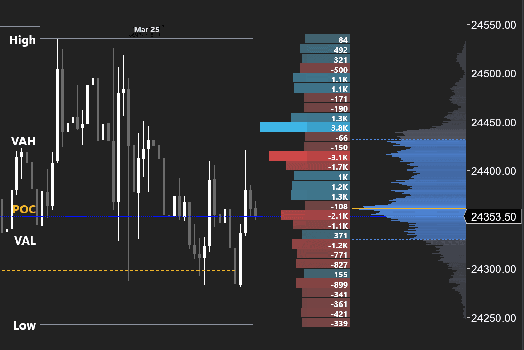
Find Where the Big Money Traded
Standard volume bars show you how much traded per candle. Volume Profile shows you at which price. This distinction is everything. A bar with 50,000 contracts might have 40,000 of them concentrated at a single price level — that's your POC, and it acts as a magnet for future price action.
The indicator automatically calculates and plots the Point of Control (POC), Value Area High (VAH), and Value Area Low (VAL) — the range where 70% of volume traded. When price trades outside the value area and fails to find acceptance, it tends to rotate back. When it breaks through with volume, it's a sign of genuine directional conviction.
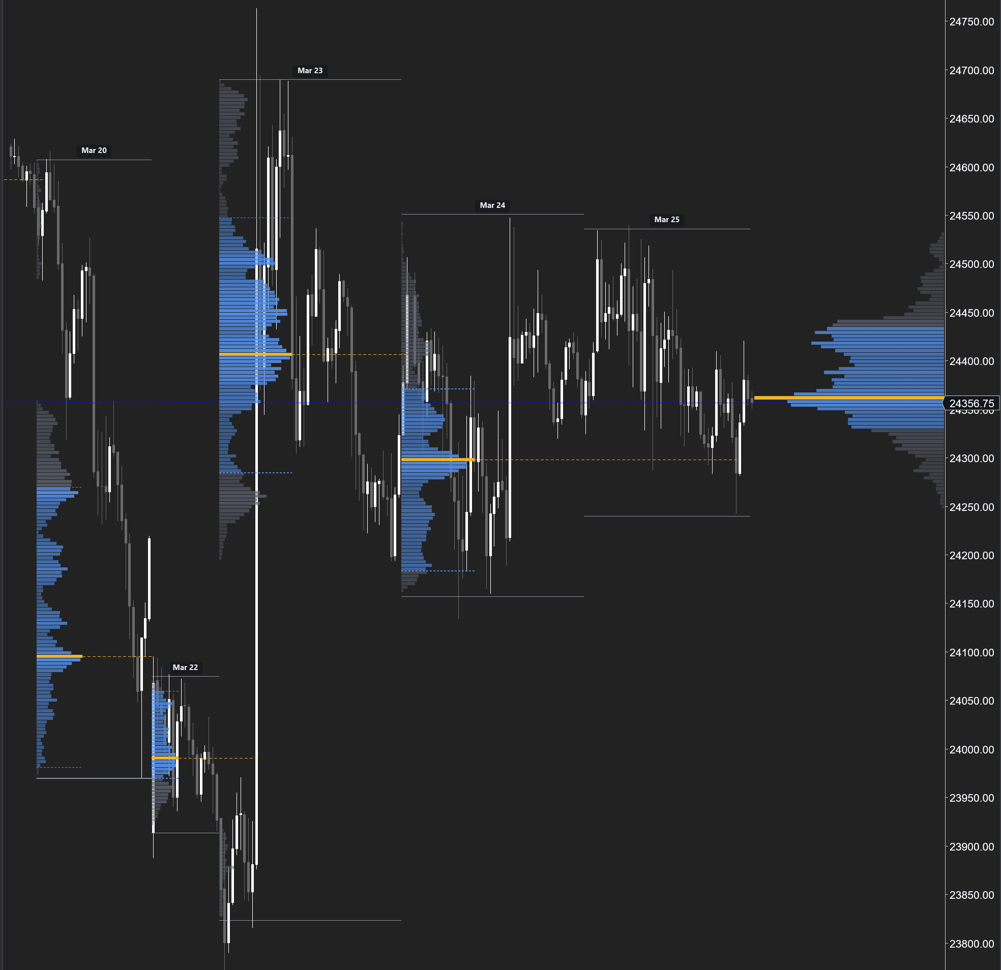
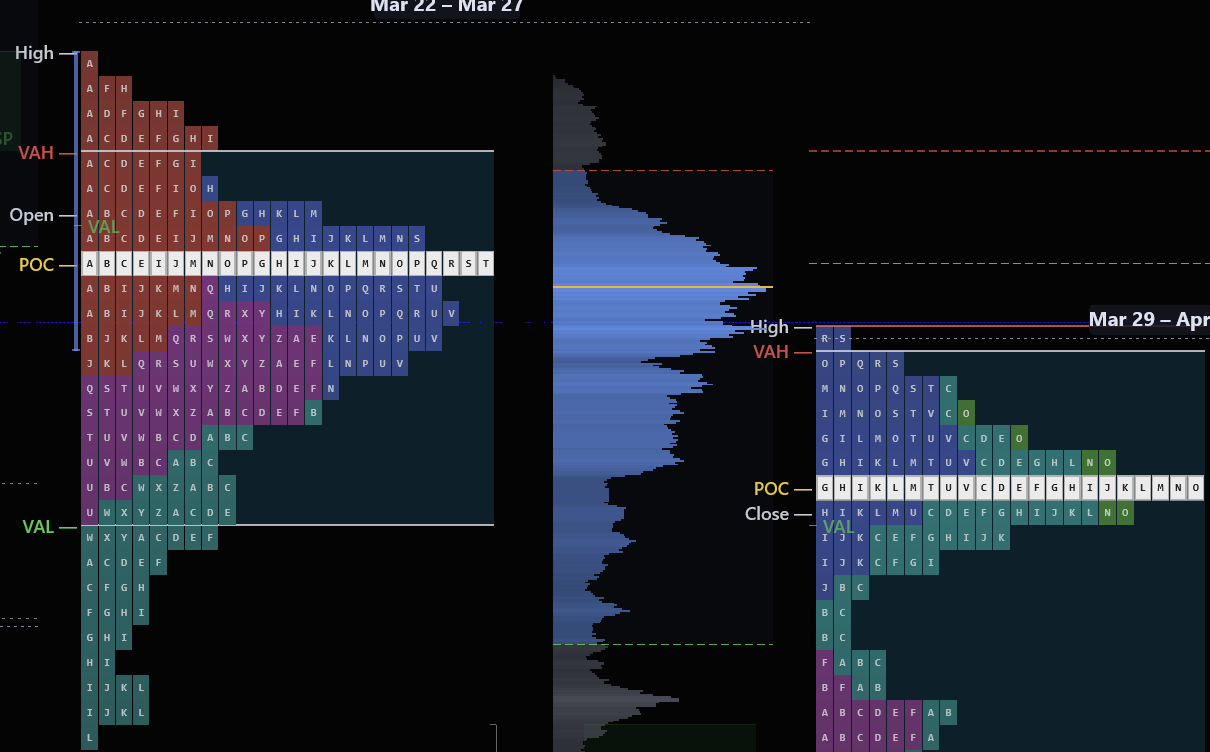
Session Profiles
Volume profiles for each session with POC marked as a yellow horizontal line. Identify where volume concentrated during each session — these levels become intraday support and resistance. When price revisits a prior session's POC, watch for a reaction.
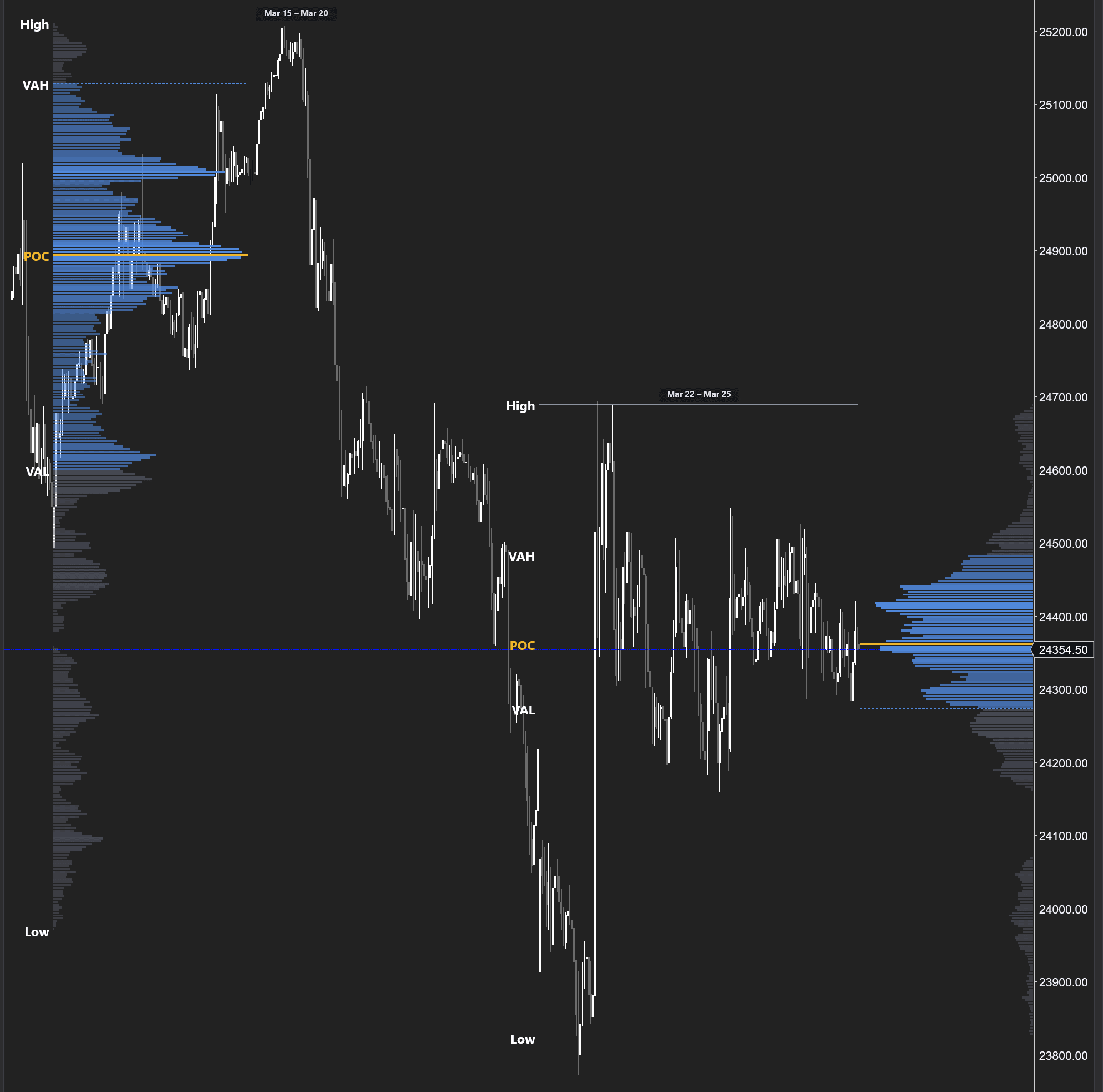
Weekly Composite
Multi-day composite profiles with labeled High, VAH, POC, VAL, and Low. The wider the histogram bar, the more contracts traded at that price. Institutions build positions over days — composite profiles reveal exactly where those positions are concentrated.
Delta-Colored Profile
A volume profile where each row is colored by net delta — blue for net buying, red for net selling. This answers the question standard volume profiles can't: not just where volume traded, but whether it was buying or selling. Crucial for understanding who controls each price level.
Use weekly composite profiles to set your bias for the day. If price opens inside the prior week's value area, expect rotation. If it opens outside, look for a trend day back toward the POC or continuation away from value.
What this tells you
- The fair value price where 70% of volume traded (Value Area)
- Key levels that act as magnets for price (POC)
- Whether price is trading above/below value — critical for daily bias
- Where institutions built positions over the session or week
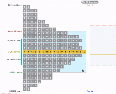
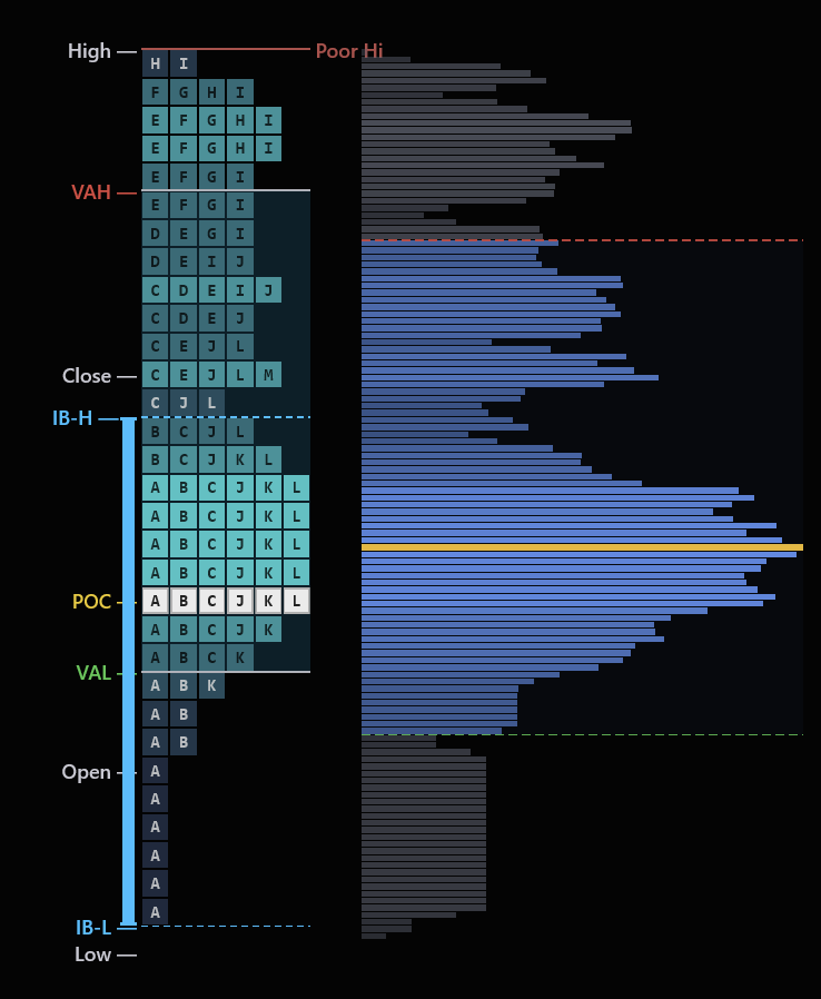
Read the Market's Auction in Real Time
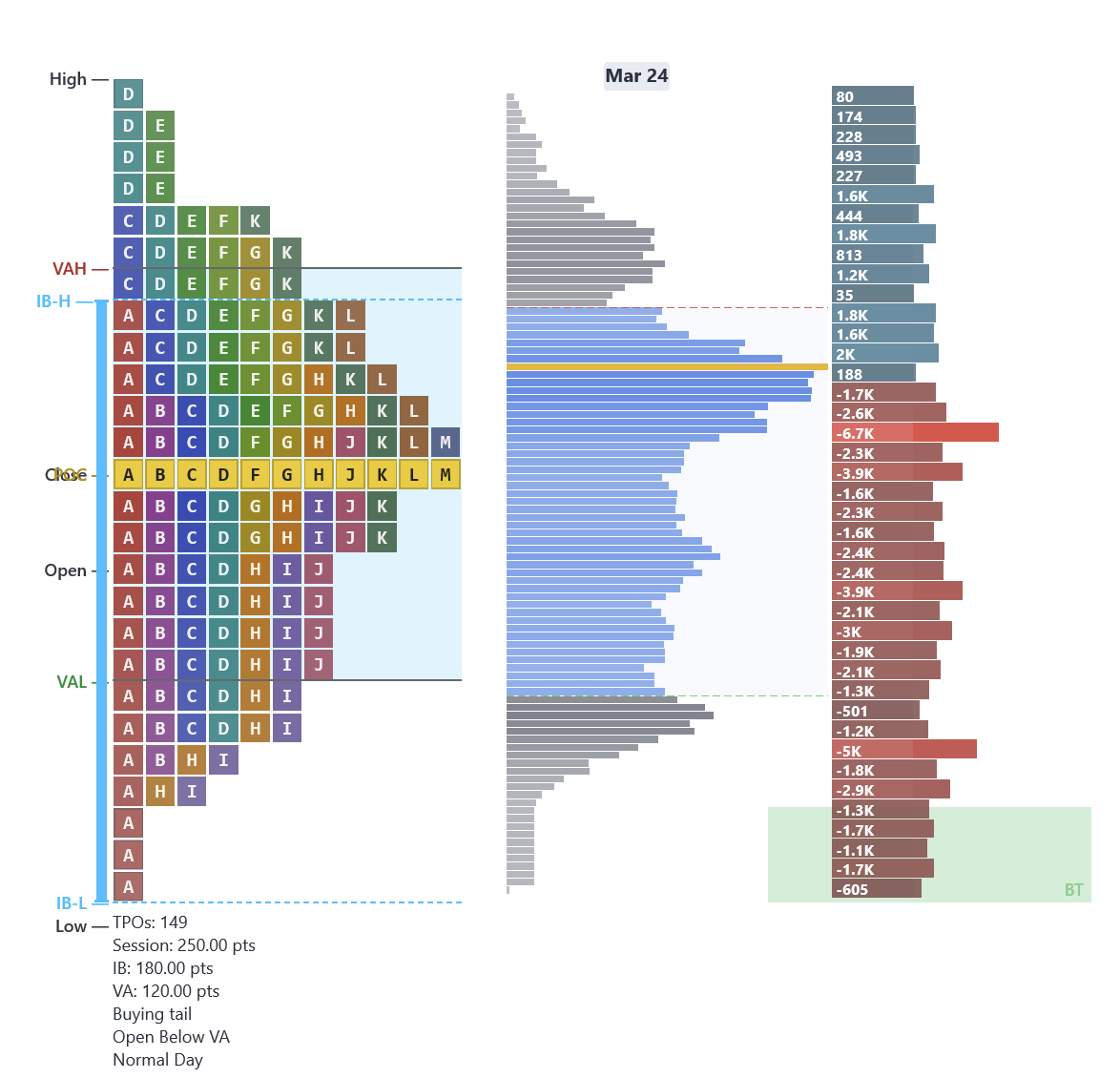
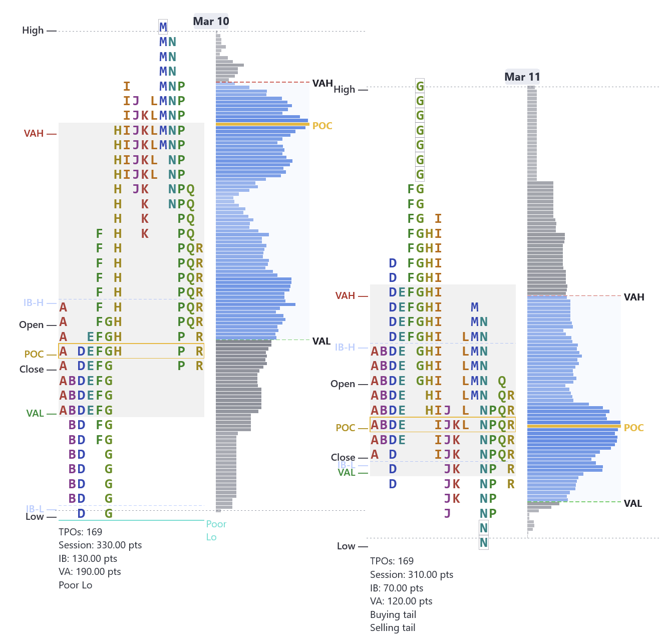
Standard charts show you where price went. Market Profile shows you where price stayed. By organizing each 30-minute period into TPO letters that stack at every price level, you can see the session's story at a glance — where value was accepted, where the market moved through quickly, and where the auction is still incomplete.
The indicator automatically plots the full TPO profile with POC, Value Area, Initial Balance, poor highs and lows, and single prints — all labeled on every session. Profile shapes, open type, and day type classification become immediately visible.
Profile Shapes
D, P, b, double distribution
Poor Hi / Lo
Incomplete auctions labeled
Initial Balance
IB-H and IB-L every session
Open Type
Inside, above, or below value
Real chart examples from our indicator:
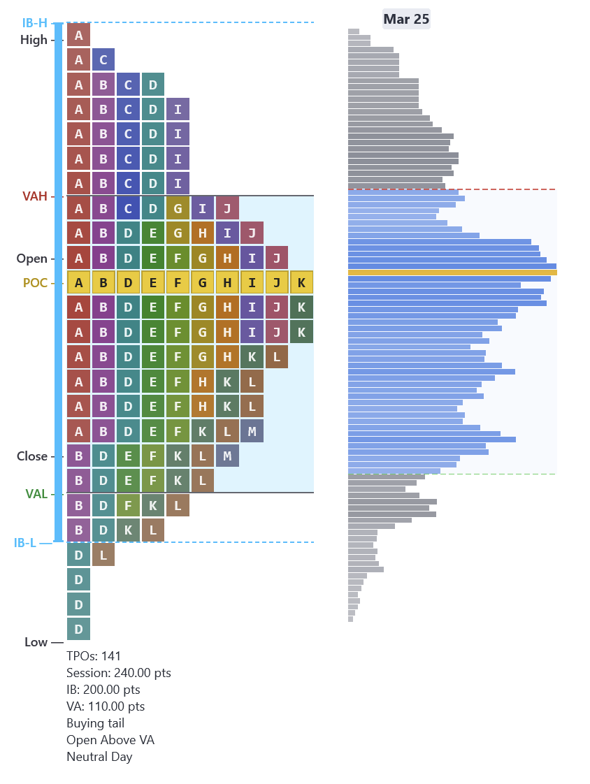
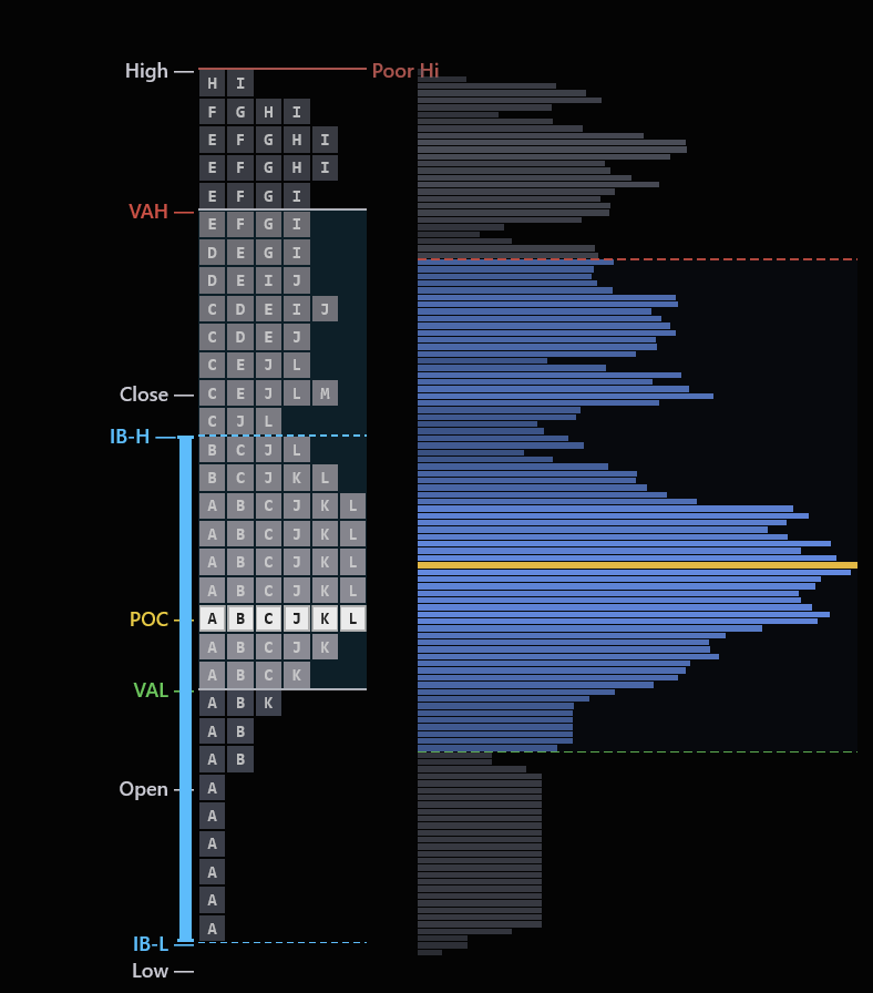
D-Shape (Balanced)
Bell curve profile — POC in the center, thin tails. Fade the extremes, target the POC.
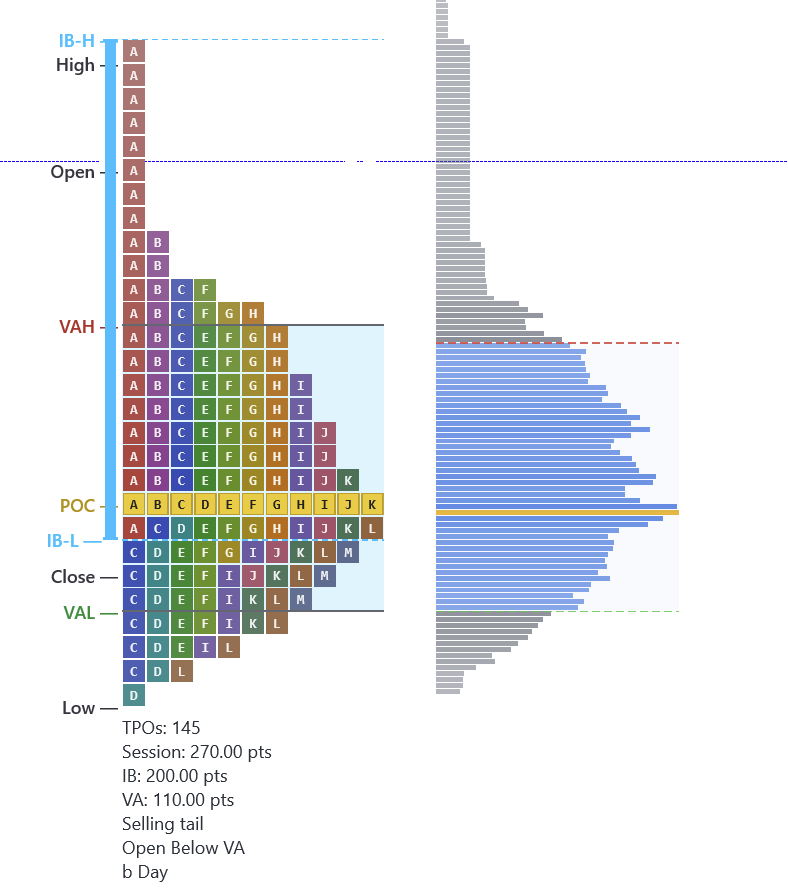
b-Shape (Sell-Off)
Fat at the bottom, thin tail at the top. Initiative selling drove price down all session.
P-Shape (Rally)
Fat at the top, thin tail at the bottom. Price rallied and value concentrated at the highs.
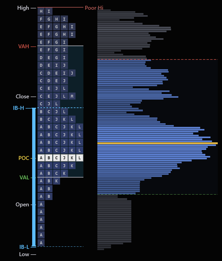
Incomplete Auctions Are Magnets
A poor low is when the bottom of the profile has multiple TPO letters stacked with no clean single-print rejection — the auction never finished. The market will come back to complete the job. A poor high is the same concept at the top.
Poor high or low = no single-print tail at the extreme — buyers/sellers were never decisively rejected
These levels act as magnets — price tends to revisit them to finish the unfinished auction
The indicator labels poor highs and poor lows automatically on every session
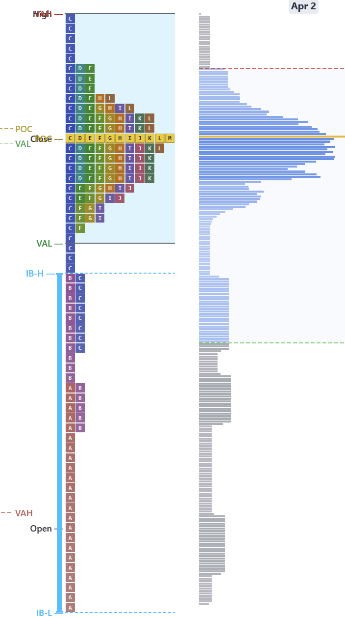
Real example: March 10 MNQ closes with a poor low. Next session opens near the prior VAL, rallies to test it, gets rejected — then drops back to revisit the incomplete auction. The poor low pulled price back like a magnet.
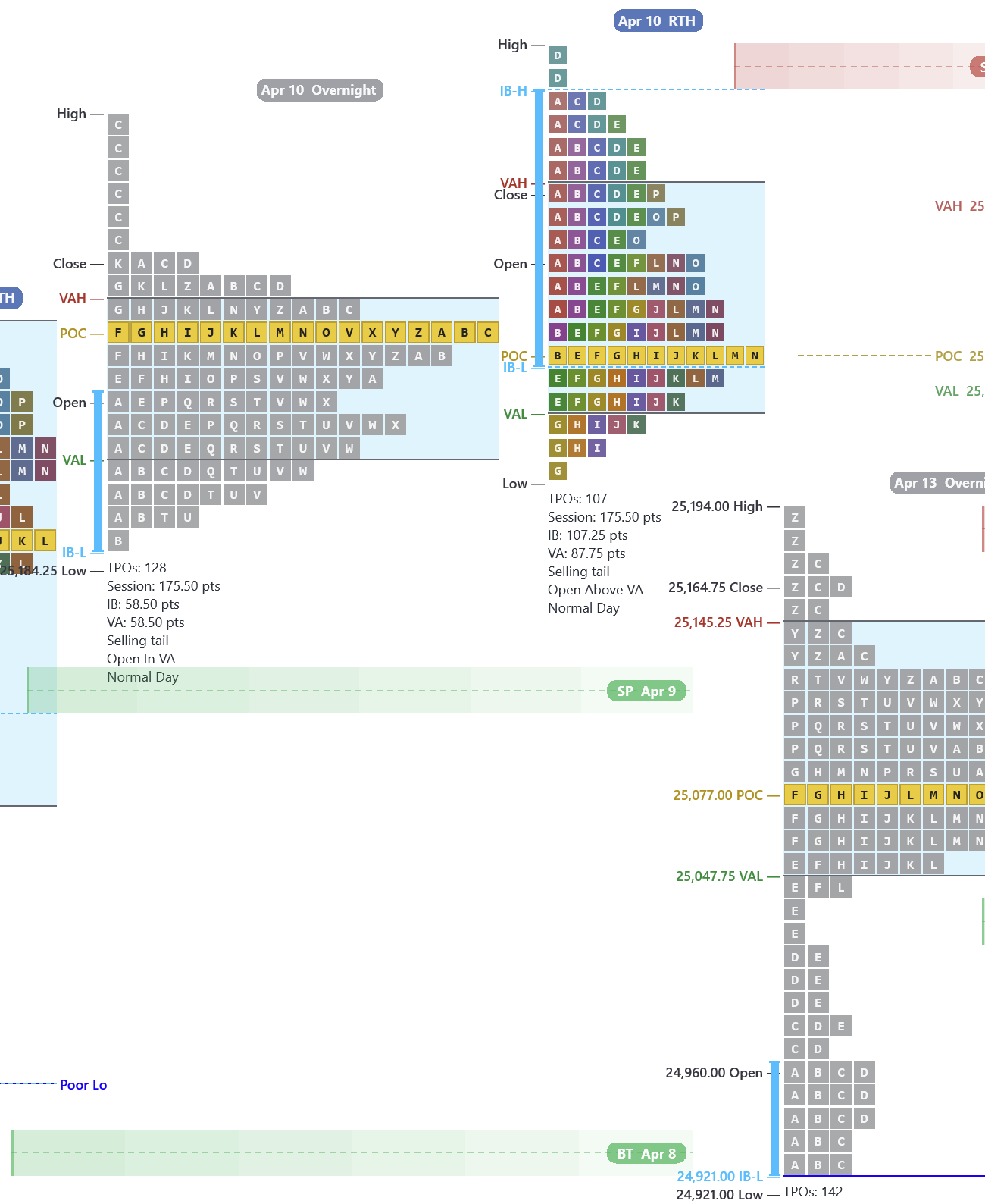
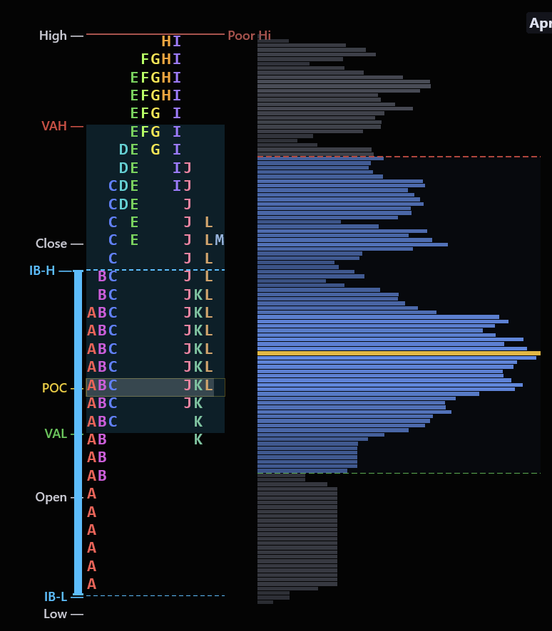
One of Market Profile's Most Powerful Setups
If price opens outside the prior session's Value Area and then re-enters it (crosses back through the VAH or VAL), there is roughly an 80% probability that price will travel all the way to the other side of the Value Area.
Price opens above VAH → sells off → drops back inside VA → likely travels to VAL
Price opens below VAL → rallies → pushes back inside VA → likely travels to VAH
Based on auction market theory — if the market rejected the extreme and returned to value, it has momentum to travel through
Real example: April 10 RTH opens outside value above the prior session's VAH, fails to hold, and re-enters the value area. From there it gaps down and takes out the prior day's (April 9) Value Area Low, continuing lower — textbook 80% Rule. Price then rallies off the April 8 buying tail, confirming that tail as support.
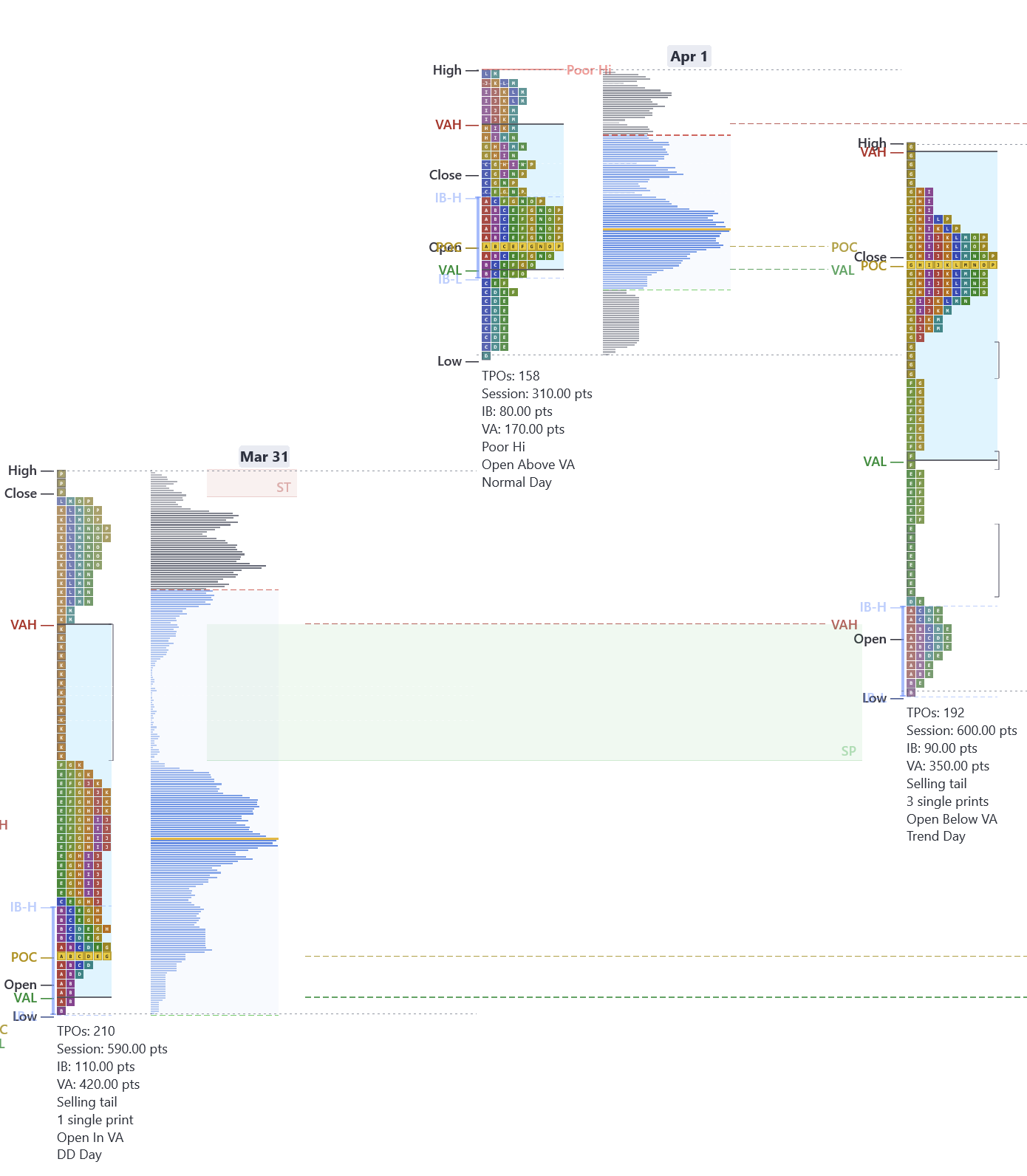
Where the Market Moved Fast and Never Came Back
A single print is a price level where only one TPO letter appears — the market visited that price during one 30-minute period and never returned. These zones represent initiative activity where one side drove price through aggressively.
Single prints separate two value areas in a double distribution — they mark the repricing zone
When price revisits single prints, expect a reaction — either a bounce (initiative confirmed) or a fill (initiative unwound)
The indicator highlights single print zones automatically with shading so you never miss them
Real example: March 31 MNQ double distribution day — the green shaded zone between the two value clusters is a single print area. The next session moves through it as price retests the prior initiative zone.
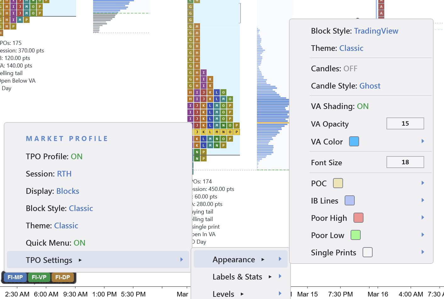
One-Click Configuration
Every Market Profile setting is right in the menu — TPO Profile, IB Lines, Poor Hi/Lo labels, Single Prints, Value Area shading, POC colors, and more. Switch between Market Profile and Delta Profile with a single toggle. No separate indicators to manage, no conflicting settings.
Right-click any session to see the full auction:
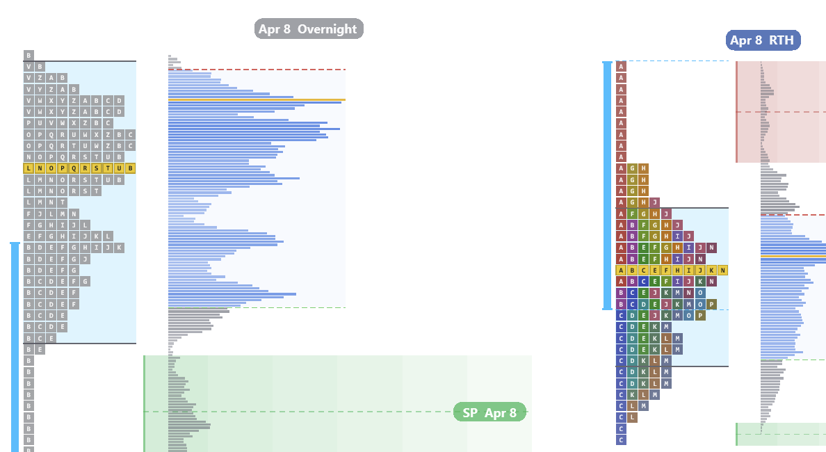
Overnight Session Analysis
Futures trade nearly 24 hours a day. If you only analyze the regular session, you are missing half the auction. The overnight session is where institutions process earnings, economic data, and global macro flows. By the time RTH opens, overnight participants have already established value, tested key levels, and left behind single prints that become support and resistance during the day.
Split the overnight (Globex) session from RTH to see each auction independently. In this example, single prints from the overnight auction act as a floor — the C period tests the overnight singles and bounces cleanly, confirmed by the volume profile. Reviewing the overnight profile before RTH is not optional.
Split overnight and RTH into separate profiles
Overnight single prints become RTH support and resistance
Overnight POC, VA, and session levels as pre-market reference
Volume profile confirms participation at key overnight levels
Built-In Themes
Switch between Market Profile themes with one click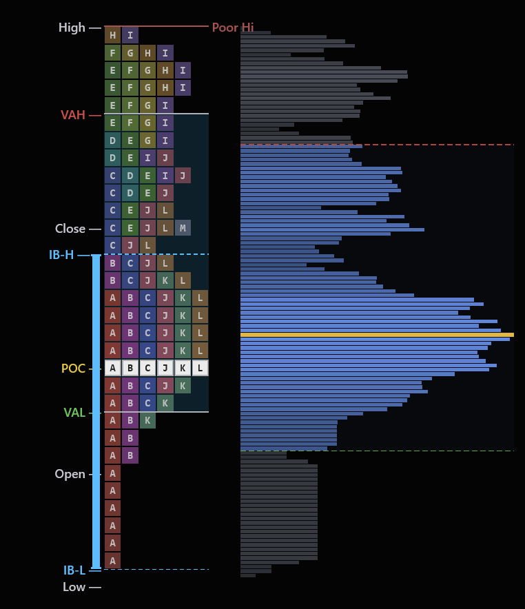
Classic
Color-coded TPO letters with rainbow periods
Heatmap
Heat intensity shows time density at each level
Mono
Clean single-color for distraction-free analysis
Session
Session-colored periods for time-based reading
Split
Split profile with separate buy/sell sides
Weekly
Multi-day composite view for swing traders
Combine profile shapes with footprint confirmation. A P-shape profile looks bullish, but if cumulative delta is flat, the rally was short covering — not real buying. The profile tells you what happened. The footprint tells you whether to trust it.
What this tells you
- Profile shape at a glance — D (balanced), P (rally), b (sell-off), or double distribution
- Poor highs and poor lows — incomplete auctions that act as magnets for future price
- Initial Balance levels — the first hour's range that frames the entire session
- Open type — whether price opened inside, above, or below the prior Value Area
- 20+ themes — dark, light, heatmap, mono, and custom presets
- Split overnight and RTH profiles for full-session context
New to Market Profile?
We built a free, in-depth learning section that teaches you everything from scratch — with real chart examples from this indicator.
What Is Market Profile?
TPO charts, single prints, poor highs & lows, excess tails
Initial Balance Framework
IB width, day type prediction, range extensions
Profile Shapes
D-shape, P-shape, b-shape, double distribution, trend days
Volume Profile vs Market Profile
Time at price vs contracts at price — when they agree and diverge
Composite Profiles
Value area migration, naked POCs, developing vs settled profiles
Trading Setups
Open type, 80% rule, IB extensions, poor high/low retests
Two Views of Market Aggression
Other platforms sell cumulative delta and delta bars as separate paid indicators. We've built both directly into the same indicator as the footprint — a first for NinjaTrader. Toggle between them instantly from the menu. Cumulative Delta tracks the running session total of aggressive buying minus selling, answering the big-picture question: who has been in control all day? Delta Bars show the net aggression on each individual bar, so you can see exactly how much conviction is behind every candle.
Both modes render with Bollinger Bands, EMAs, and a built-in delta squeeze detector — when the bands compress, delta is coiling and a large directional move is about to fire. Bars are colored by imbalance direction and intensity, and you can choose from 10+ themes that match your chart style.
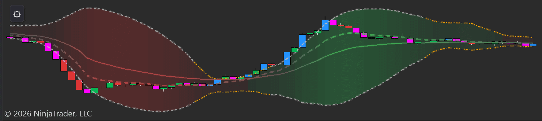
Cumulative Delta
The cumulative delta flows as a multi-colored ribbon beneath your chart with Bollinger Bands and EMAs. Rising ribbon = net aggressive buying is increasing. Falling ribbon = net aggressive selling. The colored bands make divergences between price and delta immediately visible — essential for spotting distribution at tops and accumulation at bottoms.
When the Bollinger Bands squeeze tight, delta is consolidating — just like a price squeeze, a delta squeeze signals that aggressive volume is about to expand in one direction.
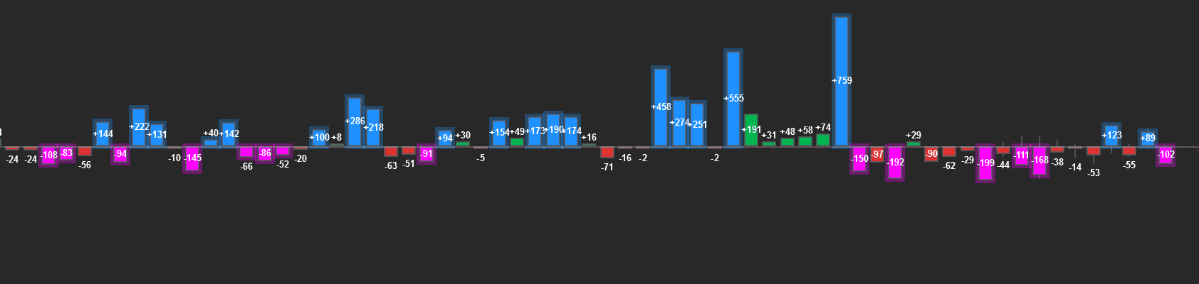
Delta Bars
Each candle gets a corresponding histogram bar: blue = positive delta (more volume at the ask), magenta = negative delta (more at the bid). The numeric label shows the exact value. A bar with +759 means 759 more contracts traded aggressively at the ask than at the bid.
Bars are colored by imbalance intensity — so extreme delta spikes stand out visually. Watch for large delta at key support/resistance levels to confirm institutional participation.
Bullish Divergence
Price makes a lower low, but CVD makes a higher low. Sellers are pushing price down, but there's less aggressive selling on each push — passive buyers are absorbing the flow. Watch for a reversal.
Bearish Divergence
Price makes a higher high, but CVD makes a lower high. Buyers are pushing price up with less conviction each time — smart money is selling into the rally. Watch for a reversal or distribution.
Pay attention to delta relative to the move. A large green candle with only +30 delta means the move was driven by passive order absorption, not aggressive buying — it's likely to reverse. A small candle with +500 delta means buyers are flooding in but being absorbed — expect the dam to break.
What this tells you
- Whether aggressive buying or selling is driving the current move
- The exact net buying vs. selling pressure on every single bar
- Divergences that signal hidden accumulation or distribution
- Delta squeeze — when Bollinger Bands compress, a directional explosion is coming
- Whether a breakout has real conviction behind it or is likely to fail
Where One Side Overwhelmed the Other
An imbalance occurs when buying or selling volume at a specific price level exceeds the other side by a significant ratio (typically 3:1 or more). A stacked imbalance is when 3 or more consecutive price levels show this same directional imbalance — signaling that large, aggressive orders swept through those prices.
These zones are significant because they represent prices where one side of the market committed heavily. When price returns to a stacked buying imbalance zone, remaining passive buy orders may still be resting there — creating support. Stacked selling imbalances mark prices where heavy selling occurred and often become resistance.
The indicator detects and plots these automatically:
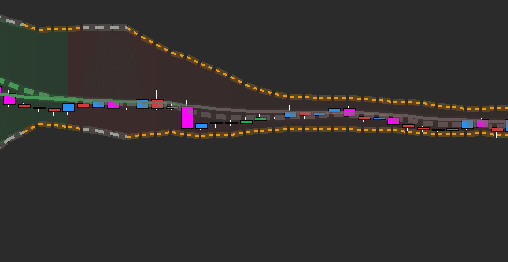
Stacked Imbalances Close-Up
Inside the footprint, stacked imbalance zones are highlighted as horizontal bands at the exact price levels where consecutive 3:1+ imbalances occurred. These bands mark the precise prices where large aggressive orders entered — the footprint of institutional activity.
Imbalance Zones on Chart
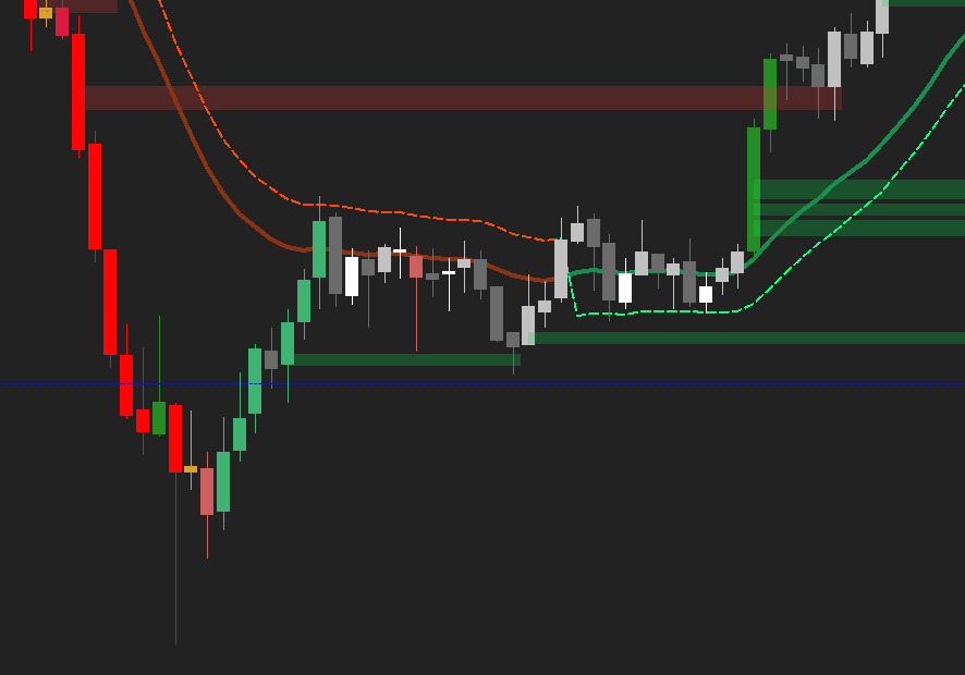
A 1-minute NQ chart with 5-minute stacked imbalance zones projecting forward — green for buying (support), red for selling (resistance). The cumulative delta ribbon confirmed the downtrend the entire way, and the aggressive negative delta spike at the bottom marked the exhaustion point. Imbalance zones mark the levels, delta confirms the direction.
Reading the Phases of a Trade:
Imbalance Takeout
Bullish buying takes out a bearish stacked imbalance zone (red). Green imbalance zones form below as buyers establish a new floor. The EMA crossover is just beginning.
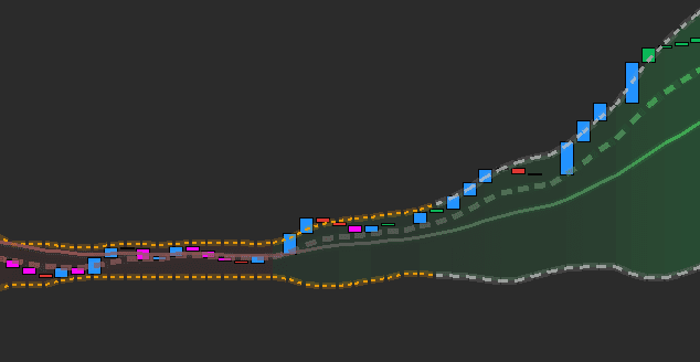
Delta Squeeze Breaks
Cumulative delta breaks out of a squeeze — Bollinger Bands expand as aggressive blue prints flood in. The delta bars flip strongly positive, confirming the trend has legs.
Exhaustion & Reversal
Price tops out at a bearish imbalance zone (red). Selling imbalances form at the high, EMAs cross bearish, and a new selling imbalance zone projects forward as resistance.
Delta Confirms the Turn
Cumulative delta transitions from green to red — the squeeze compresses and then breaks bearish. Aggressive magenta prints confirm sellers have taken control.
Beyond Stacked Imbalances — 10+ Signal Types:
Big Imbalance
Single-level imbalances exceeding your min volume threshold
Oversized Imbalance
Extreme volume imbalances — often institutional block orders
Inverse Imbalance
Diagonal imbalances comparing bid at one price to ask at the next — early reversal signal
Reversal Imbalance
Imbalances that form against the prevailing trend direction
Absorption
Heavy aggressive volume hitting a level but price refuses to move — a large passive order is absorbing the flow
Exhaustion
Extreme volume at the end of a move with diminishing follow-through — the trend is running out of fuel
Stopping Volume
A spike in volume that halts a move — often marks the exact turning point
Fading Momentum
Delta decreasing bar-over-bar while price continues — weakening conviction signals reversal
Max Delta
The single bar with the highest delta in the visible range — marks peak aggression
The highest-probability setup in order flow trading: footprint absorption + CVD divergence at a stacked imbalance zone. When price retests a buying imbalance zone, the footprint shows absorption (heavy selling but price holds), and CVD diverges bullish — that's your entry.
Who Controls Each Price Level
The visible range delta profile combines a standard volume profile with delta coloring across your entire visible chart. Each row shows total volume and whether that volume was predominantly buying or selling. Blue bars = net buying dominated at that price. Red bars = net selling.
This gives you a complete picture of the battleground. Prices with heavy volume and net buying are levels where buyers have established a position — they'll likely defend it. Prices with heavy selling mark supply zones. When price approaches a high-volume, high-delta level, expect a strong reaction.
The delta-colored profile anchored to the right side of your chart. Blue rows = prices where aggressive buying exceeded selling. Red rows = selling-dominant prices. The gray volume profile appears behind it for context. The width of each bar shows total volume, the color shows who was in control. Use this to find high-conviction support and resistance based on actual order flow.
What this tells you
- Which side controls each price level across your entire visible range
- High-volume + high-delta levels where strong reactions are likely
- Supply zones (heavy red) and demand zones (heavy blue) based on real order flow
- Whether current price is above or below the delta-weighted POC
Use What You Need, Hide What You Don't
Not every session calls for a full footprint chart. Maybe you just want stacked imbalance zones on a clean candlestick chart. Maybe you want cumulative delta with a volume profile but no footprint bars. Every combination works — toggle any feature on or off from one unified menu. This is not five separate indicators duct-taped together. Every feature shares the same data pipeline, the same menu, and the same license.
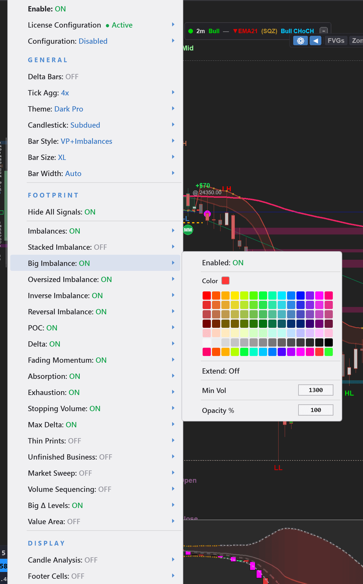
Everything In One Menu
Footprint
4 bar styles, tick aggregation, themes, candlestick style, bar size & width
Signals
Imbalances, Stacked Imbalances, Oversized, Inverse, Reversal, Absorption, Exhaustion, Stopping Volume, Fading Momentum, Max Delta, Unfinished Business
Profiles
Volume Profile (session/weekly/visible range), Market Profile (TPO), Delta Profile — all with independent colors, width, and opacity
Delta
Cumulative delta or delta bars with Bollinger Bands, EMAs, squeeze detection, and 10+ themes
New to order flow? Start with Bar Style: VP + Imbalances, Delta Bars: ON, and Stacked Imbalances: ON. This gives you volume context, delta confirmation, and key levels without overwhelming your chart.
Everything Included
Stop Paying for 5 Separate Indicators
Footprint. Volume Profile. Market Profile. Cumulative Delta. Delta Bars. Other platforms charge $50-150/month for each of these separately.
One indicator. One license. Lifetime access.