A standard candlestick chart shows you four numbers: open, high, low, close. That is the summary. A footprint chartDefinitionA chart showing bid and ask volume at every price inside each candle. Reveals who is buying and selling. shows you everything that happened inside that candle — every contract that traded, at every price level, and whether it was an aggressive buyer hitting the askDefinitionThe lowest price someone is currently willing to sell at. If you buy at market, this is what you pay. or an aggressive seller hitting the bidDefinitionThe highest price someone is currently willing to pay to buy. If you sell at market, this is what you get..

New to these terms? POCDefinitionPoint of Control — the price with the highest volume. Where the most trading happened., Delta, ImbalanceDefinitionA price level where one side overwhelms the other by 3:1 or more. Shows where big players committed., Cumulative DeltaDefinitionRunning total of buying vs selling across the session. Shows who has been in control overall., and Volume ProfileDefinitionA histogram showing total volume at each price level. The widest bar is the POC. Shows where the heaviest trading occurred. are all explained in the glossary — tap any blue term in this guide to jump to its definition.
Think of it this way: a candlestick tells you the final score. A footprint chartDefinitionA chart showing bid and ask volume at every price inside each candle. Reveals who is buying and selling. shows you the entire play-by-play.
If you are trading futures with only candlestick charts, you are making decisions with 5% of the available information. The footprint gives you the other 95%.
How the Footprint Reveals Imbalance and Balance
This is what makes the footprint chartDefinitionA chart showing bid and ask volume at every price inside each candle. Reveals who is buying and selling. unique. A standard candlestick chart shows you the result — price went up or down. The footprint shows you the cause — where aggressive participantsDefinitionA market order that crosses the spread to execute immediately. Consumes liquidity. Pays the spread for immediacy. overwhelmed the other side, and where the market was balanced with no conviction.
At every price level inside a candle, the footprint tells you whether that level was balanced or imbalanced. A row showing 150 x 148 is balanced — neither side has an edge, and price will not move because of that level. A row showing 42 x 189 is imbalanced — buyers are 4.5 times more aggressive than sellers at that price. That is the force that pushes price.
More importantly, the footprint shows you where large participants are entering the market. When you see a cluster of heavy volume at a specific price — especially with imbalancesDefinitionA price level where one side overwhelms the other by 3:1 or more. Shows where big players committed. — that is an institutional player committing size. These participants have the capital to push the market from balance into imbalance, creating the trends that everyone else is trying to trade.
The footprint does not just show you where imbalancesDefinitionA price level where one side overwhelms the other by 3:1 or more. Shows where big players committed. exist — it shows you where large participants are positioned who could push the market into imbalance. Balanced areas with heavy volume are potential coiled springs. When those participants decide to act aggressively, the imbalance begins and the trend is born.
This is why professional traders watch the footprint at key levels. They are not just looking for existing imbalancesDefinitionA price level where one side overwhelms the other by 3:1 or more. Shows where big players committed. — they are watching for the buildup of large passive ordersDefinitionA resting limit order on the DOM that provides liquidity. Doesn't pay the spread — but may not get filled. that signal a big participant is accumulating. When that participant flips from passive (limit orders) to aggressive (market orders), the imbalance explodes and price moves fast.
What This Looks Like in Practice
Here is a real 1-minute MNQDefinitionMicro E-mini Nasdaq 100 — 1/10th the size of NQ. 1 tick = $0.50, 1 point = $2. Fast moves, beginner-sized risk. (Micro Nasdaq) footprint chartDefinitionA chart showing bid and ask volume at every price inside each candle. Reveals who is buying and selling.. Each bar shows the bidDefinitionThe highest price someone is currently willing to pay to buy. If you sell at market, this is what you get. x askDefinitionThe lowest price someone is currently willing to sell at. If you buy at market, this is what you pay. volume at every price. The red zones are where sellers overwhelmed buyers. The green zones are where buyers overwhelmed sellers.
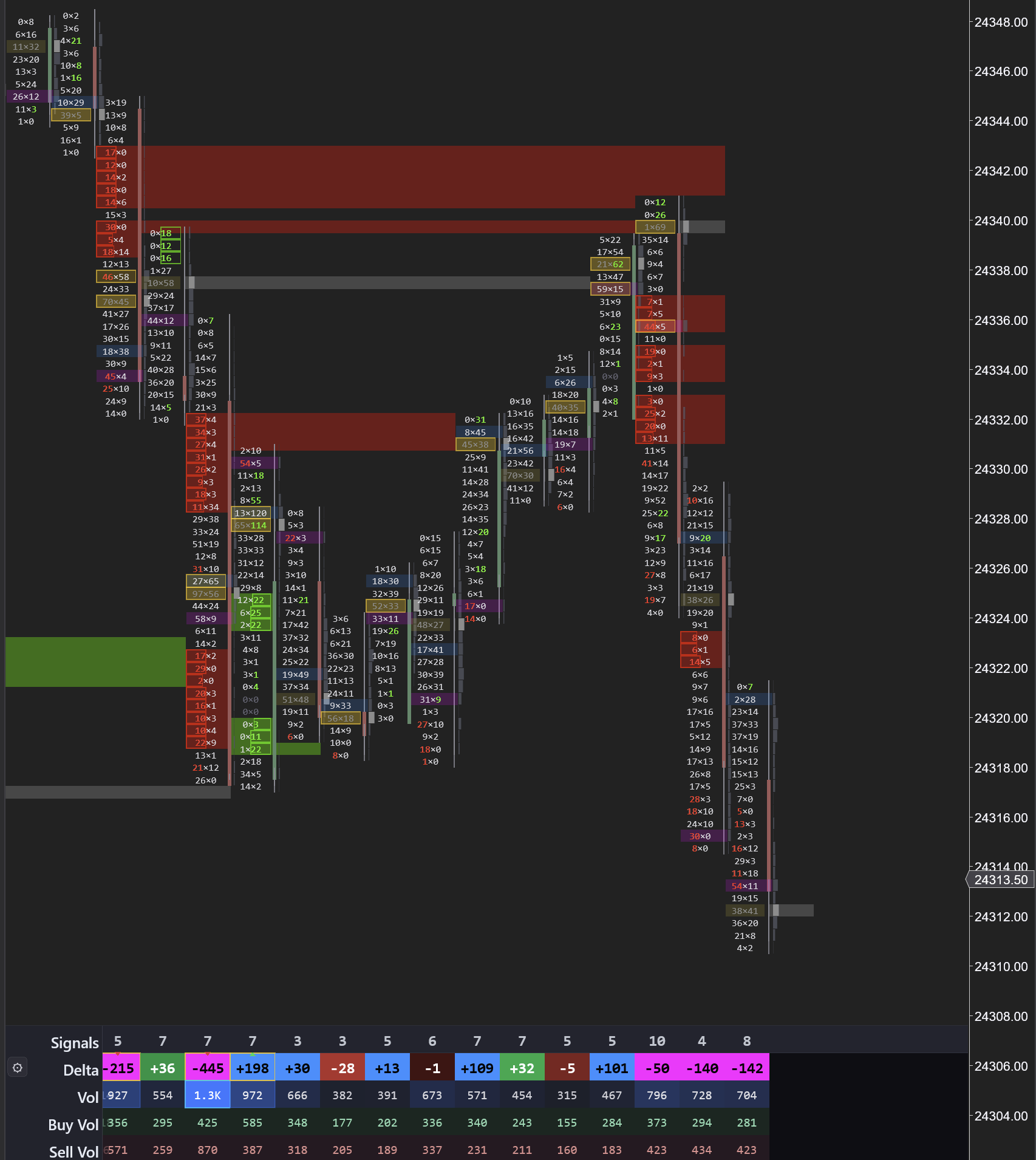
Notice the red zones at the top. Sellers showed up with heavy size. Price dropped. Then price came back to test that same area — and sellers showed up again. That told you the move lower was real.
The bottom panel makes it simple: red deltaDefinitionAsk volume minus bid volume. Positive = more buying. Negative = more selling. Shows who is more aggressive. means sellers won that bar. Green delta means buyers won. You can see the shift happen in real-time.
Key Terms You Will See on a Footprint Chart
Before we dig into the details, here are the core terms you will encounter. Each one is explained in depth later, but knowing these basics will help everything click faster.
Delta is the difference between buying volume and selling volume. Positive deltaDefinitionAsk volume minus bid volume. Positive = more buying. Negative = more selling. Shows who is more aggressive. means buyers were more aggressive. Negative delta means sellers were more aggressive. It is the single most important number on the footprint because it tells you who won.
POCDefinitionPoint of Control — the price with the highest volume. Where the most trading happened. (Point of ControlDefinitionThe price level with the highest volume. Represents fair value — where the market attracted the most interest.) is the price where the most volume traded. It is fair value — the price the market agreed on. Price tends to gravitate back toward the POC.
Volume ProfileDefinitionA histogram showing total volume at each price level. The widest bar is the POC. Shows where the heaviest trading occurred. is the histogram on the side of the chart showing how much volume traded at each price. The widest bar is the POCDefinitionPoint of Control — the price with the highest volume. Where the most trading happened.. Thin areas are prices the market moved through quickly.
ImbalanceDefinitionA price level where one side overwhelms the other by 3:1 or more. Shows where big players committed. is a price level where one side overwhelmed the other by 3:1 or more. It marks where a big player committed. Stacked imbalancesDefinition3+ consecutive price levels where one side overwhelms the other by 3:1. Marks institutional zones. — three or more in a row — mark institutional zones.
Bid x AskDefinitionThe two columns in a footprint bar. Left = sellers (bid volume). Right = buyers (ask volume). are the two numbers at each price level. The bidDefinitionThe highest price someone is currently willing to pay to buy. If you sell at market, this is what you get. (left) is selling volume. The askDefinitionThe lowest price someone is currently willing to sell at. If you buy at market, this is what you pay. (right) is buying volume. Together they show you the battle at every price.
The Anatomy of a Footprint Bar
Each footprint bar is divided into horizontal rows — one row for every price level where trading occurred during that candle. Each row shows two numbers separated by an "x":
Each row shows bidDefinitionThe highest price someone is currently willing to pay to buy. If you sell at market, this is what you get. x askDefinitionThe lowest price someone is currently willing to sell at. If you buy at market, this is what you pay.:
- Left number (bidDefinitionThe highest price someone is currently willing to pay to buy. If you sell at market, this is what you get.) — aggressive sellers. Market orders hitting resting buy limit orders
- Right number (askDefinitionThe lowest price someone is currently willing to sell at. If you buy at market, this is what you pay.) — aggressive buyers. Market orders hitting resting sell limit orders
- Example: "142 x 387" at price 18250 means 142 contracts traded on the sell side and 387 on the buy side — buyers overwhelmed sellers nearly 3 to 1

Delta at each price level:
- Simply askDefinitionThe lowest price someone is currently willing to sell at. If you buy at market, this is what you pay. volume minus bidDefinitionThe highest price someone is currently willing to pay to buy. If you sell at market, this is what you get. volume
- Positive deltaDefinitionAsk volume minus bid volume. Positive = more buying. Negative = more selling. Shows who is more aggressive. = more aggressive buying
- Negative deltaDefinitionAsk volume minus bid volume. Positive = more buying. Negative = more selling. Shows who is more aggressive. = more aggressive selling
- Heavy positive deltaDefinitionAsk volume minus bid volume. Positive = more buying. Negative = more selling. Shows who is more aggressive. at a key support level tells you buyers are stepping in with conviction
Delta is the purest measure of aggression in the market. Price can move on low volume, but sustained moves require aggressive participation on one side.